Wood Cabinets at
Particleboard Prices

CA Lic.# 1048615
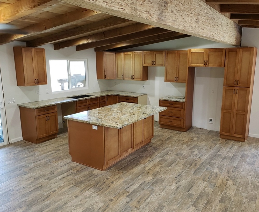
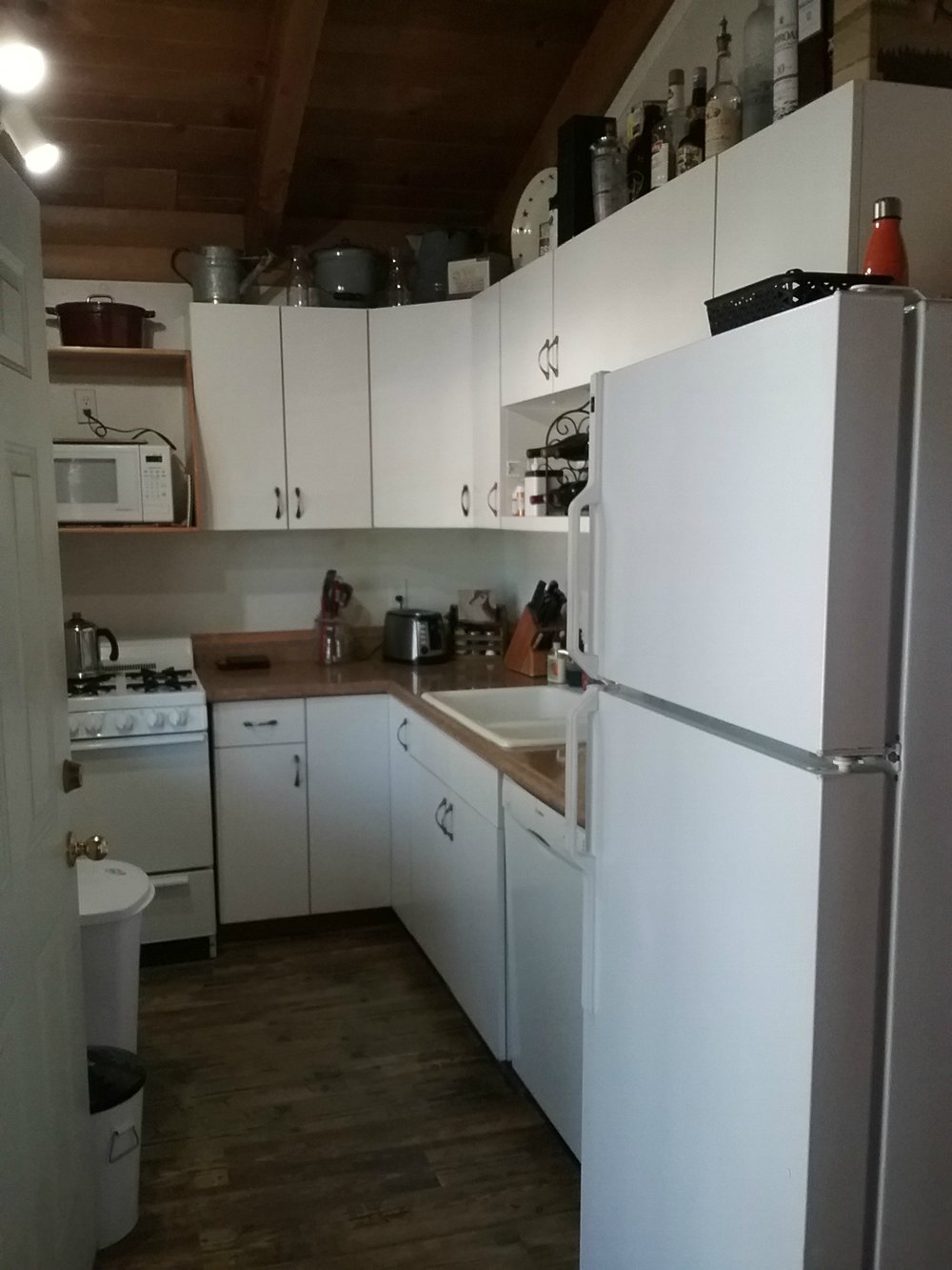
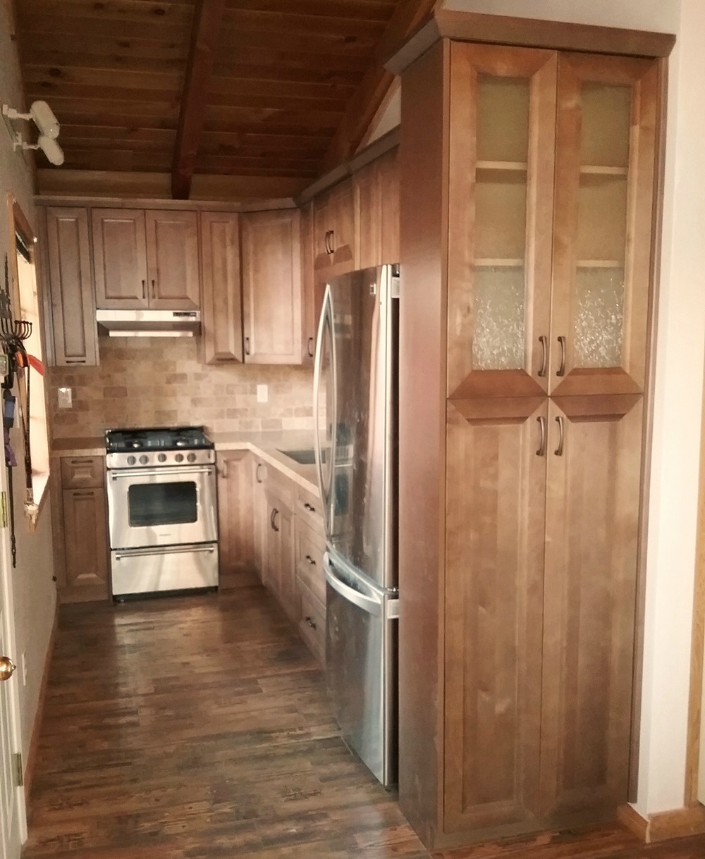
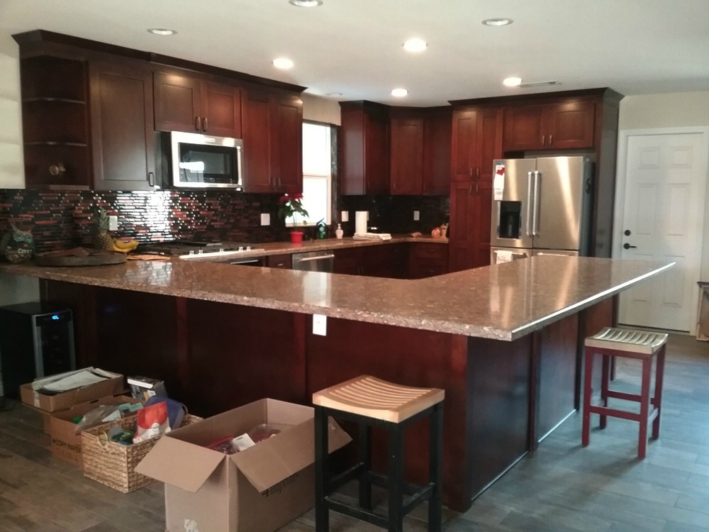
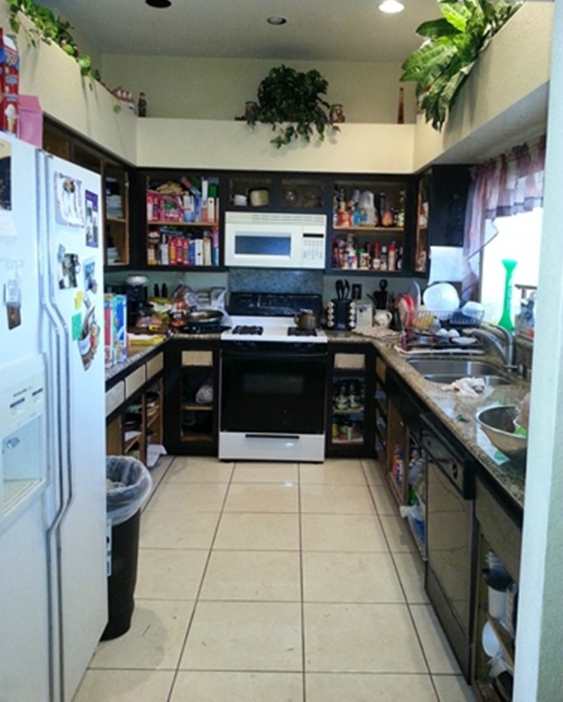
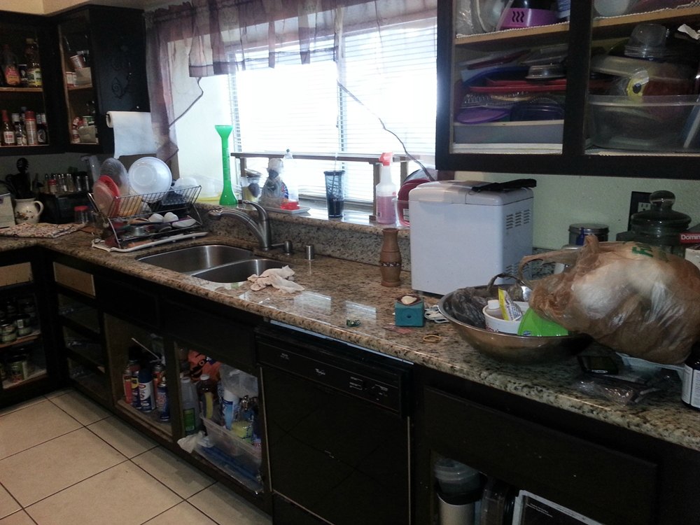
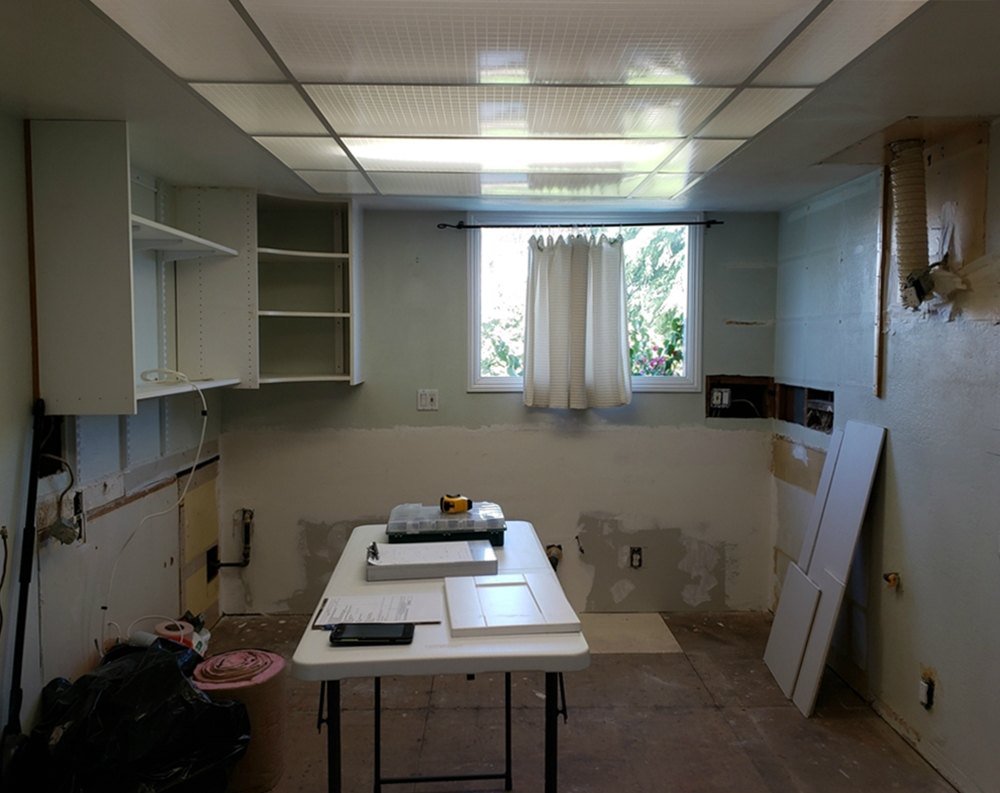
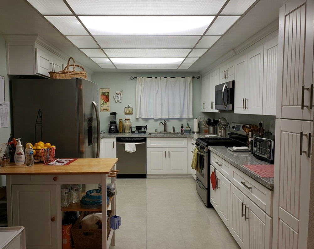
Before and After $10,000 to $25,000
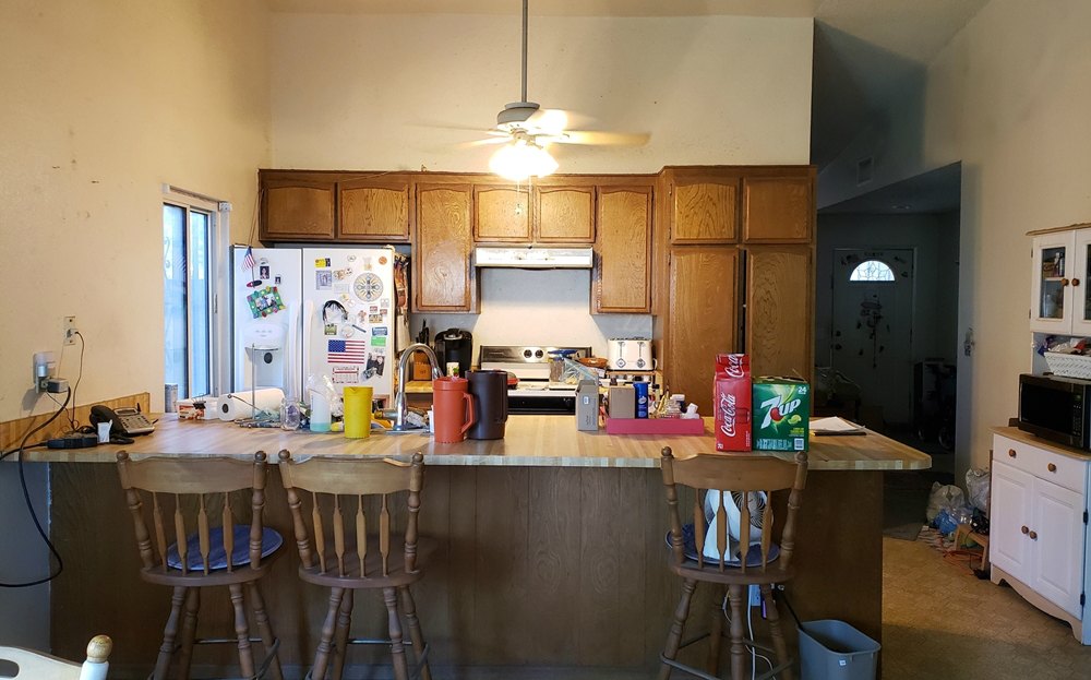
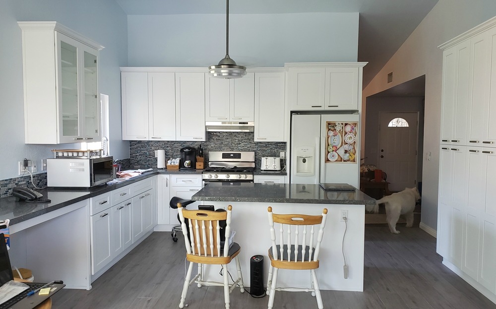
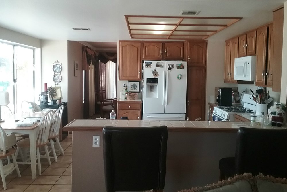
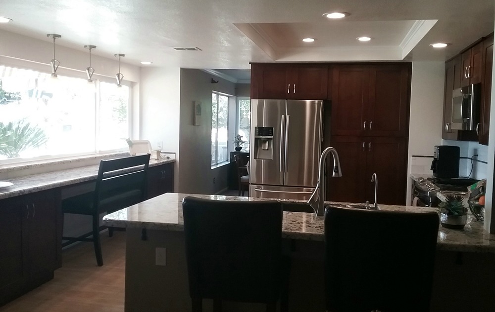
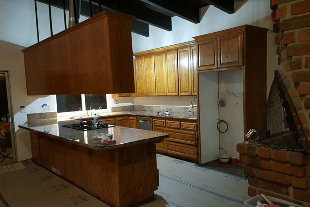
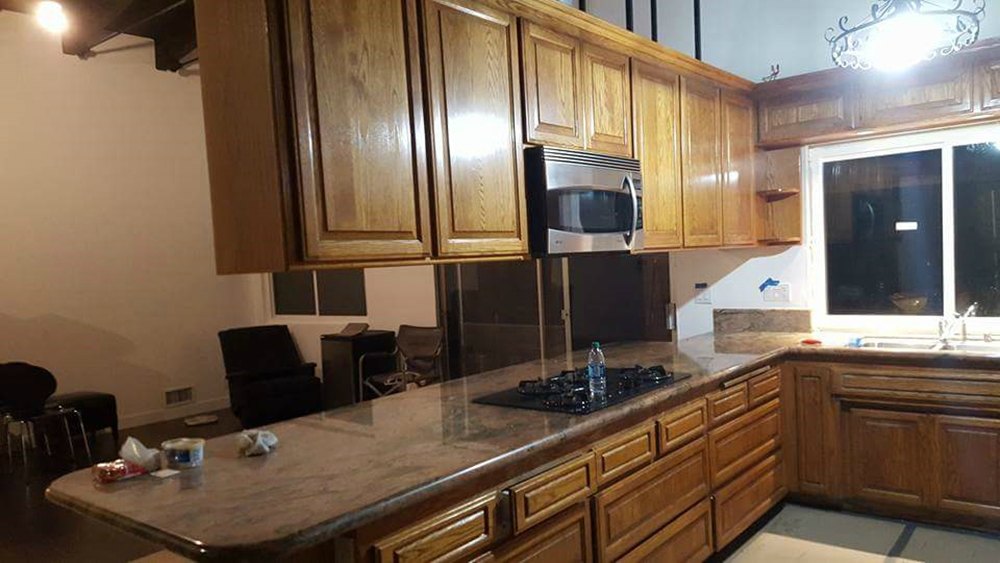
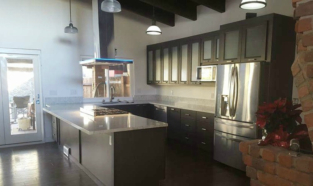
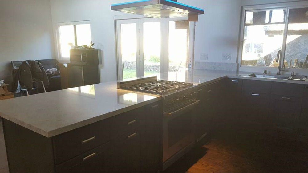
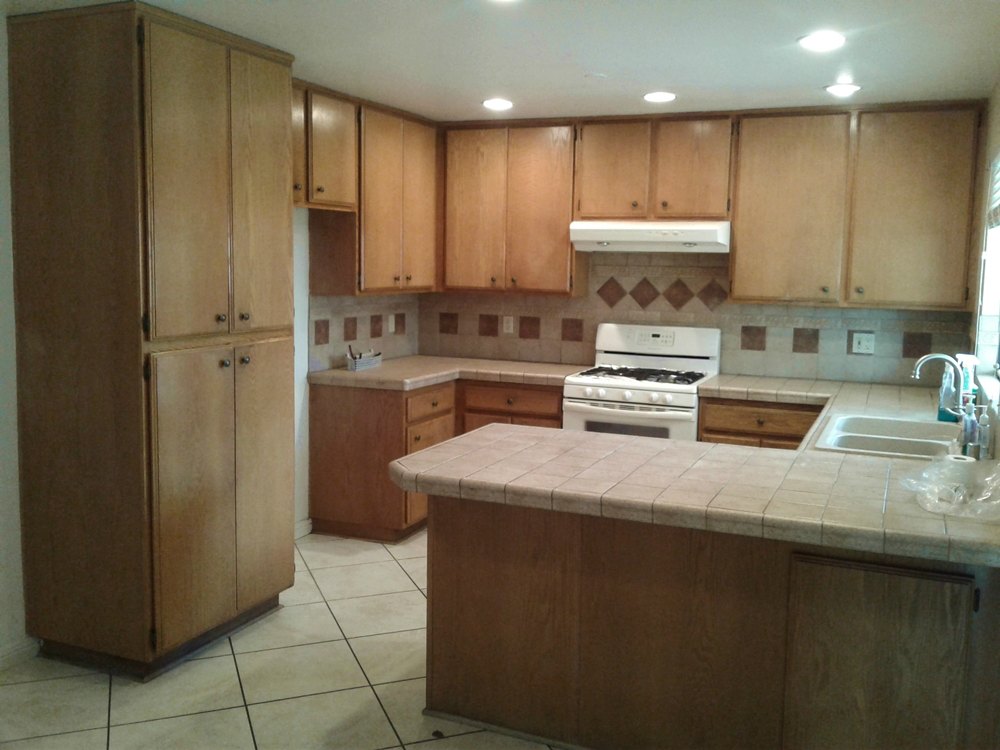
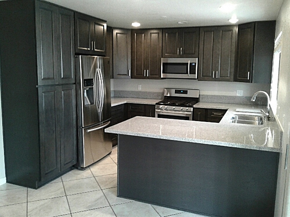
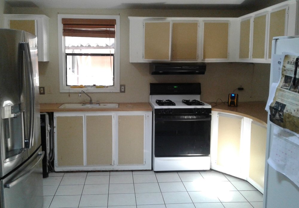
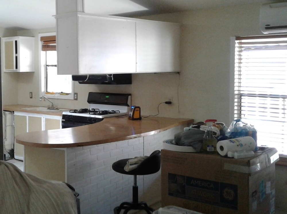
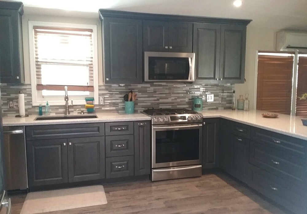
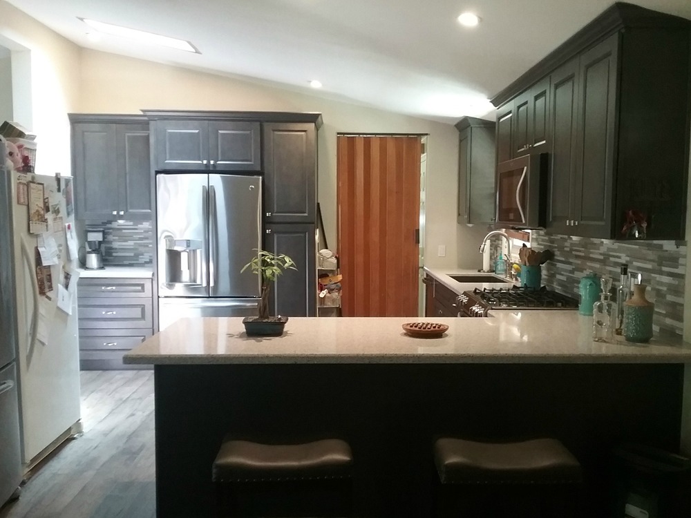
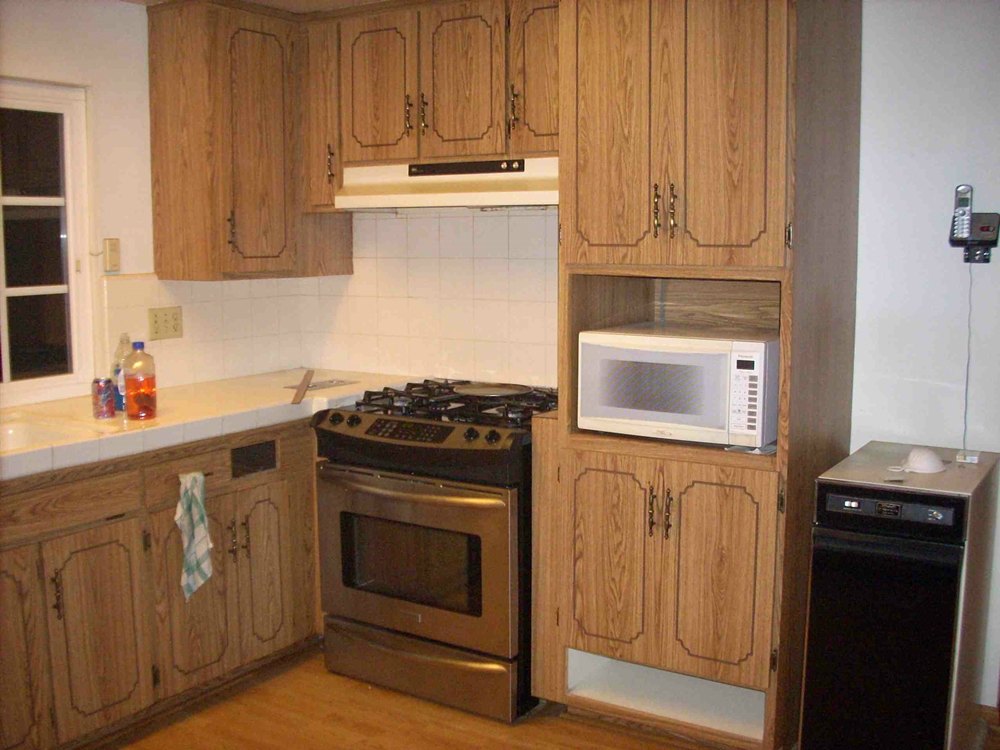
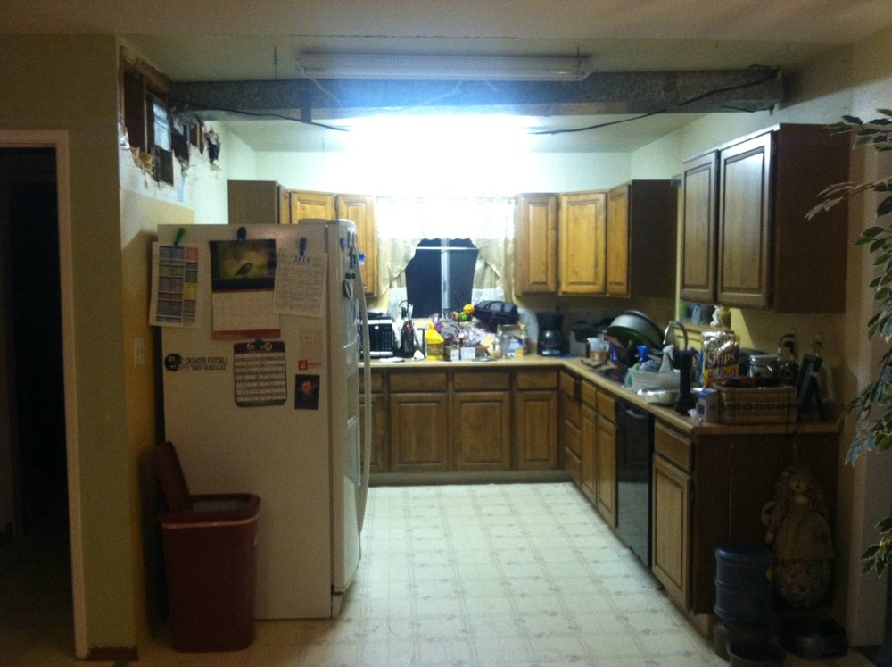
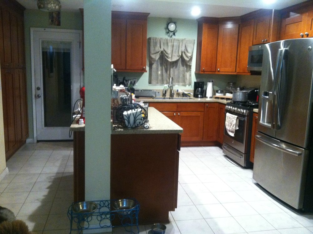
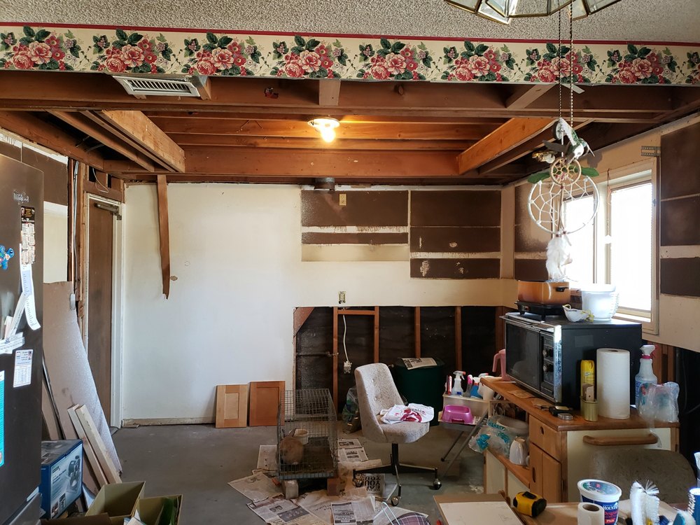
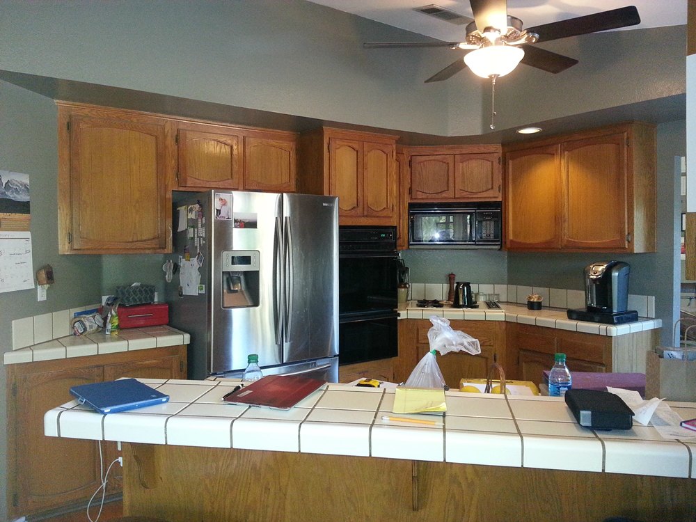
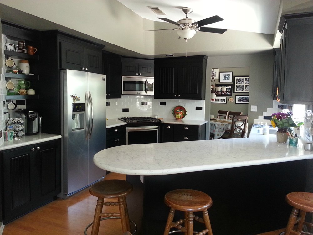
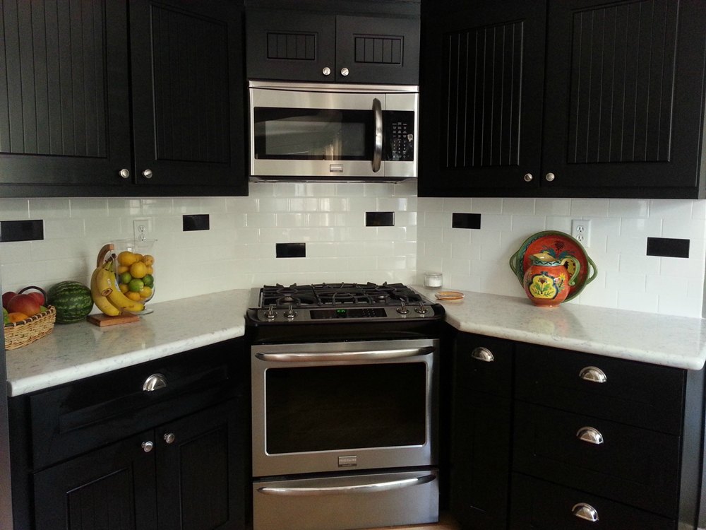
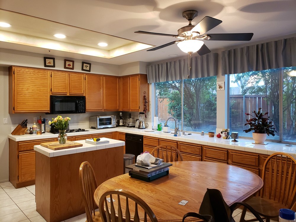
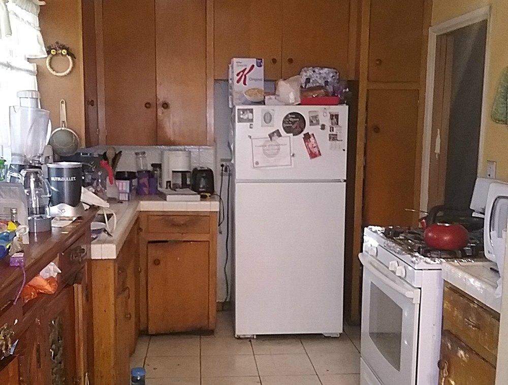
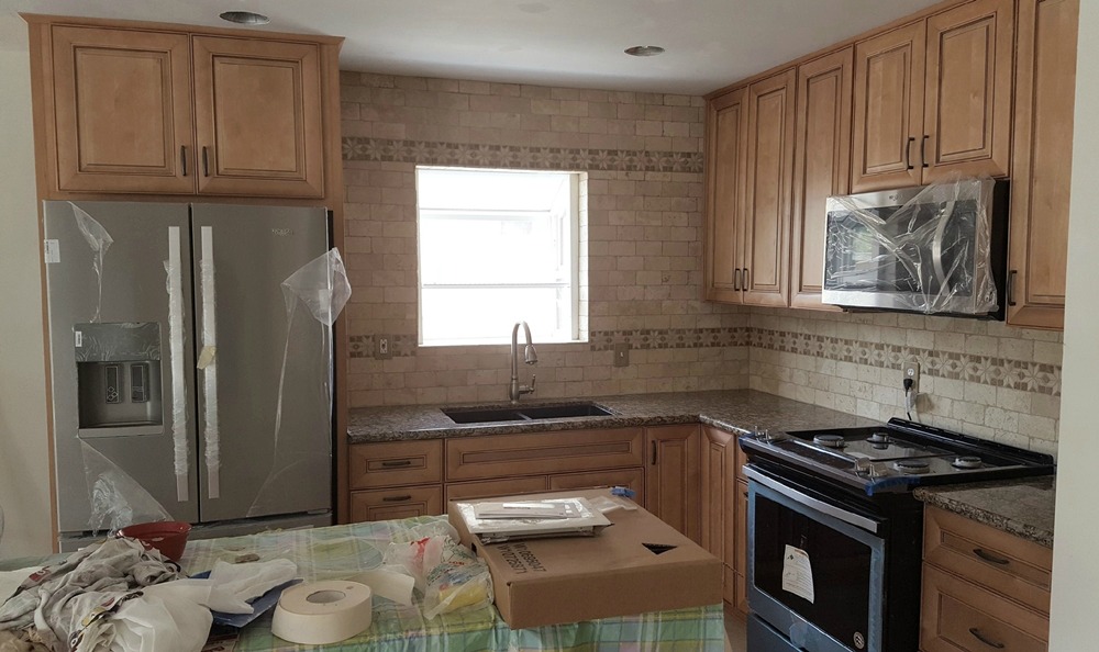
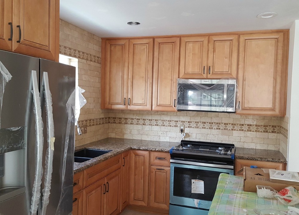
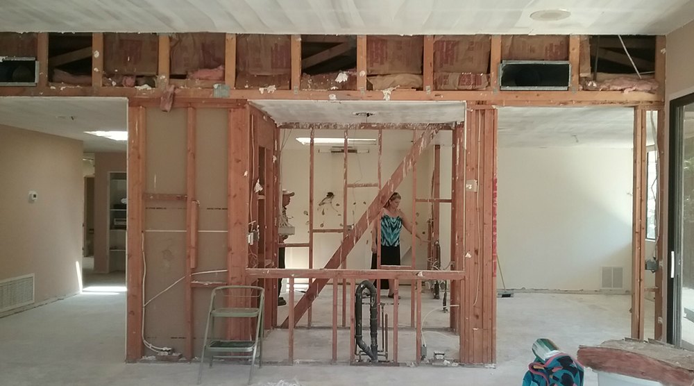
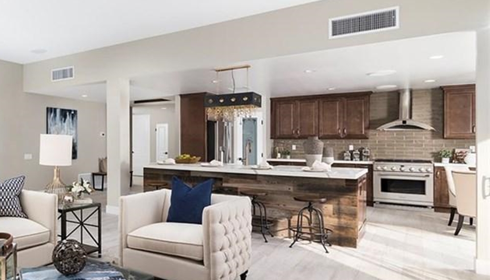
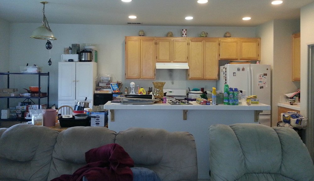
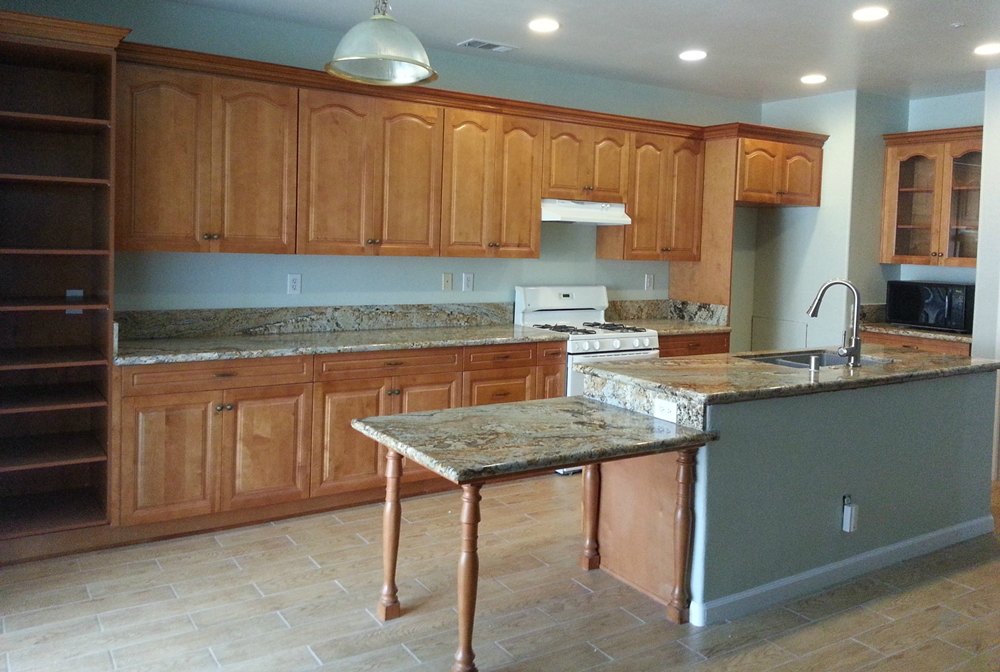
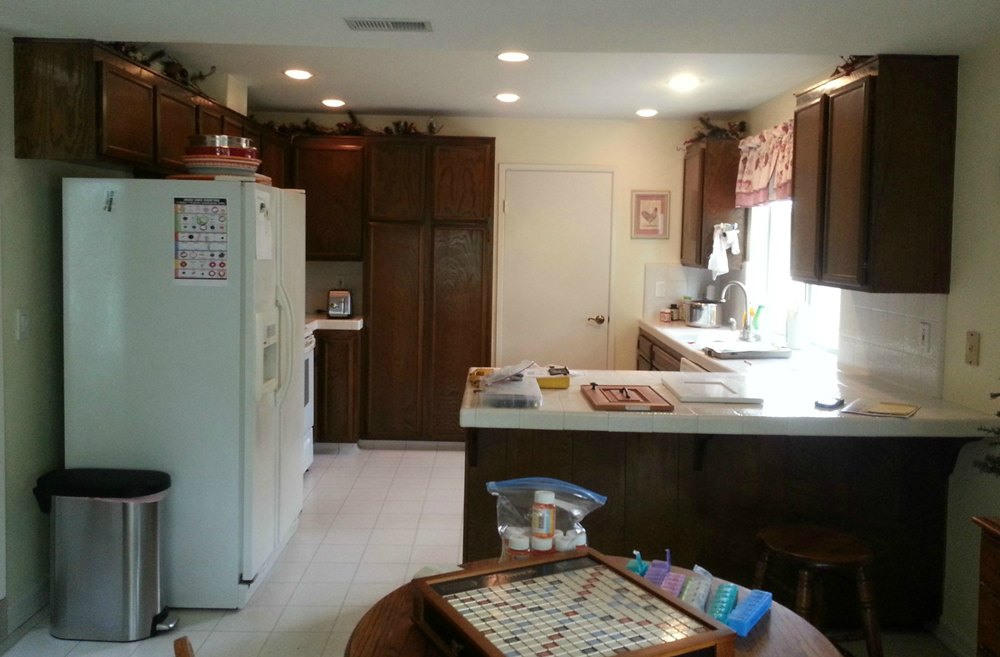
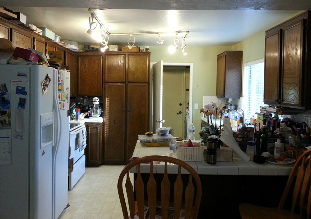
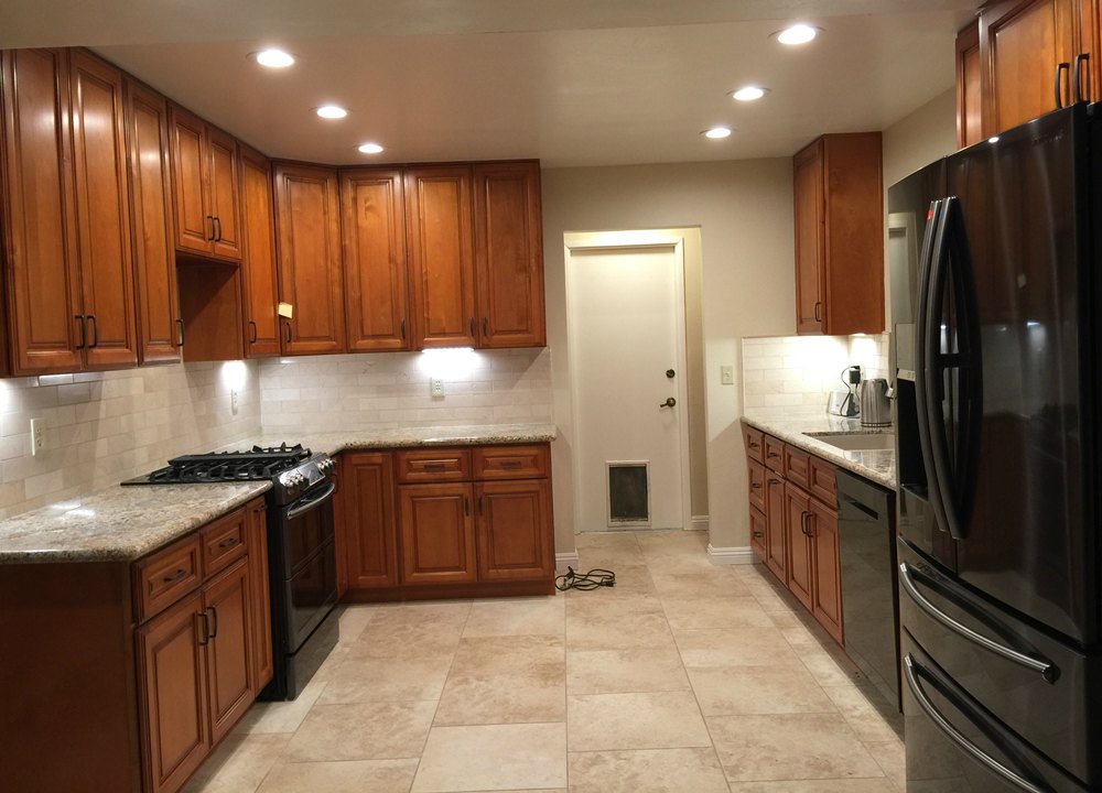
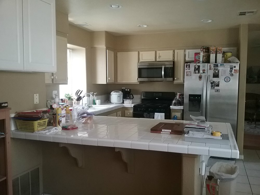
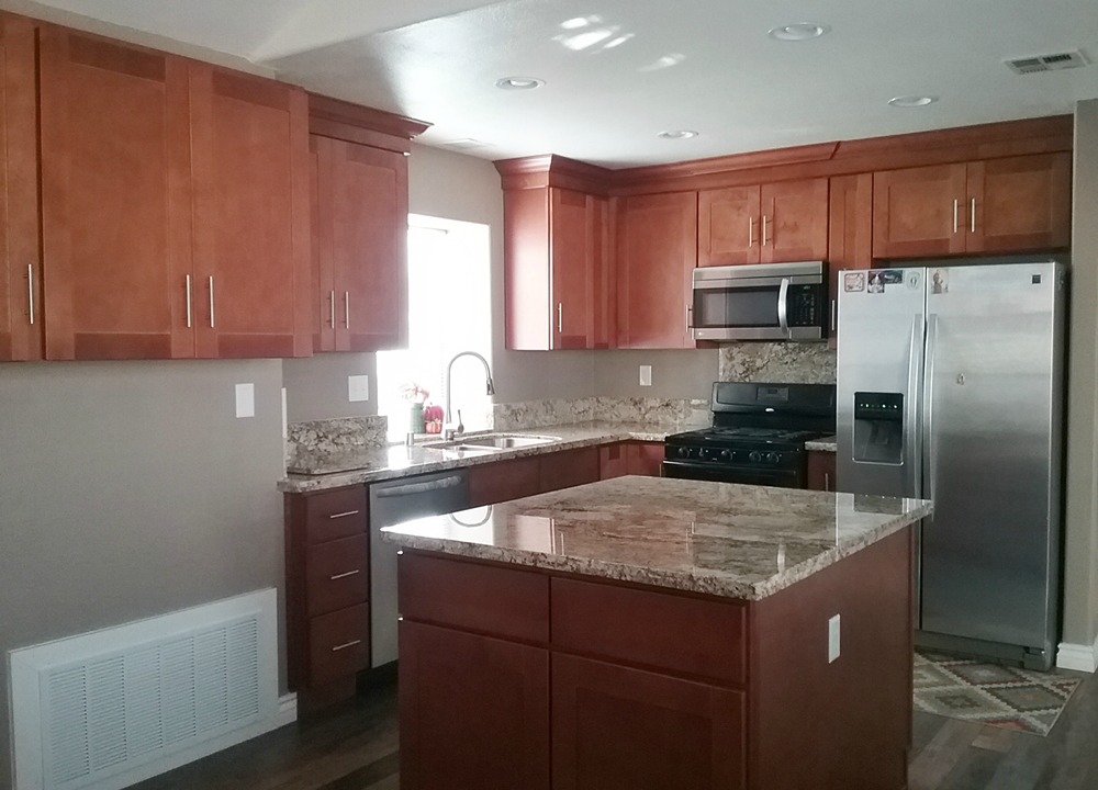
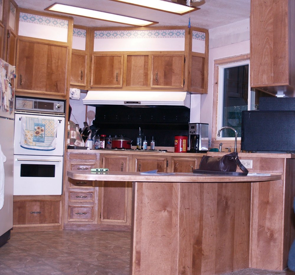
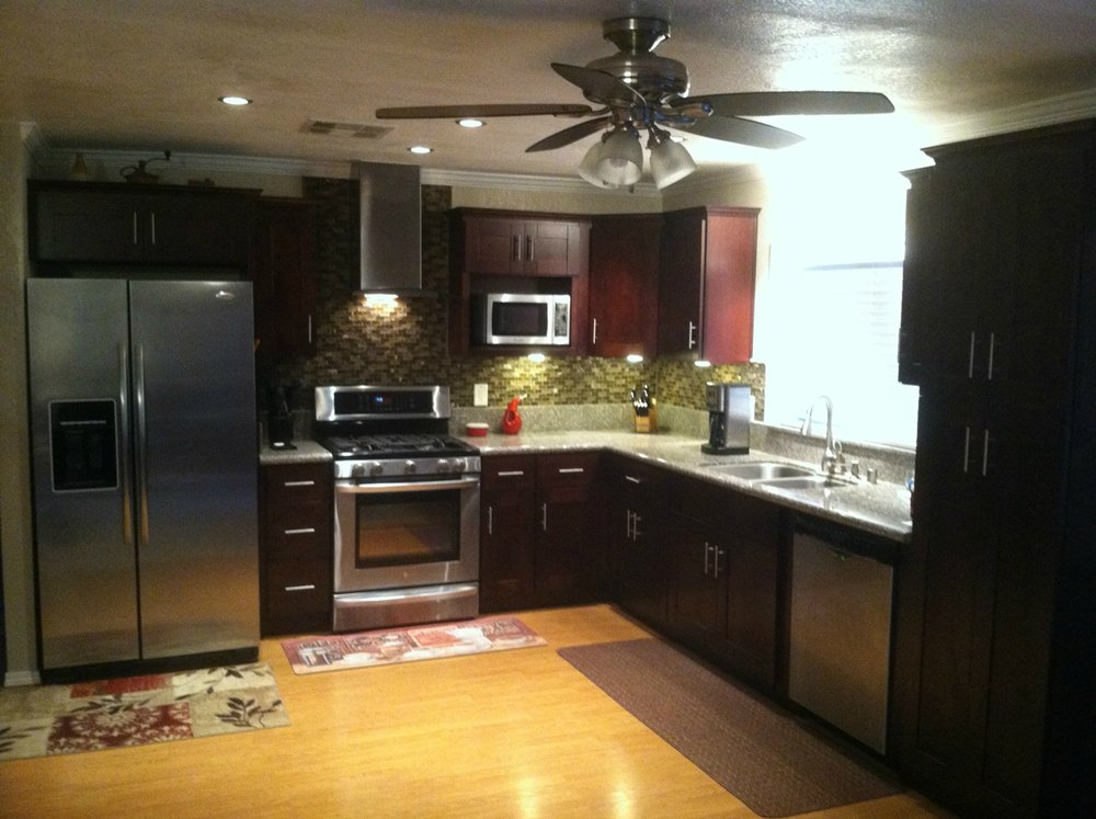
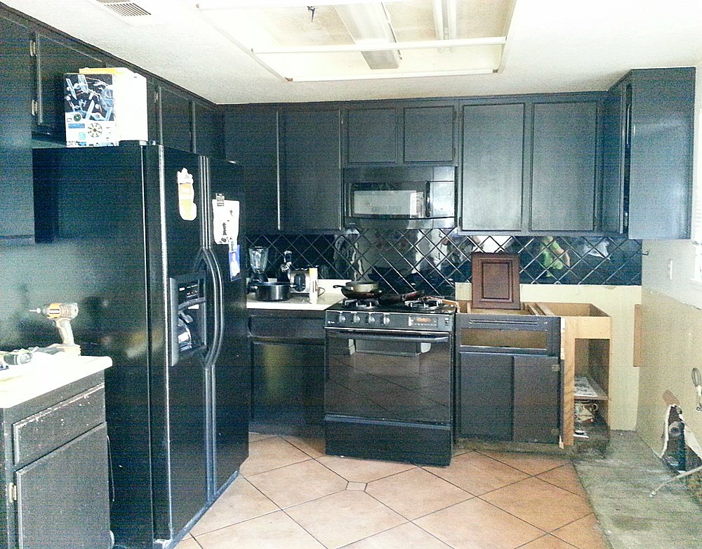
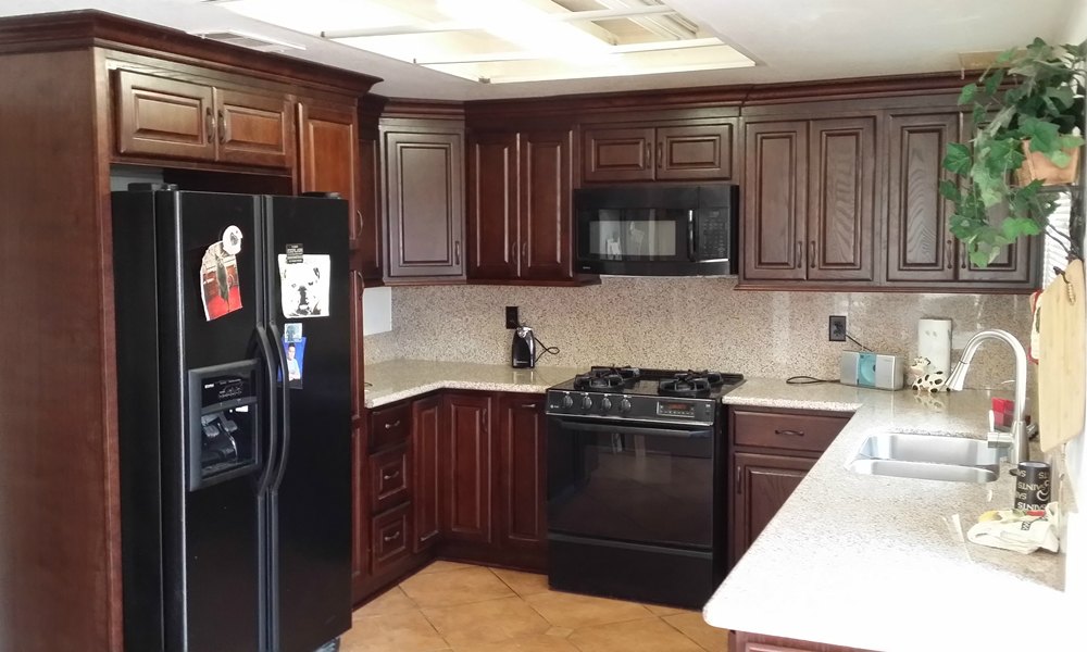
The “before and after” photos below show some kitchens we have completed in the $10,000 to $25,000 price range. Prices are for cabinets, countertops, and installation only. Other elements (such as flooring, backsplash, lighting, paint, and appliances) were an additional price.
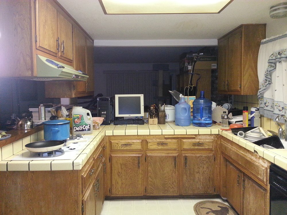
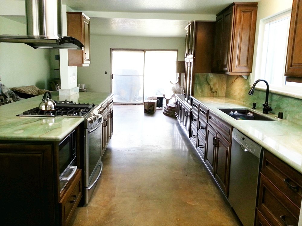
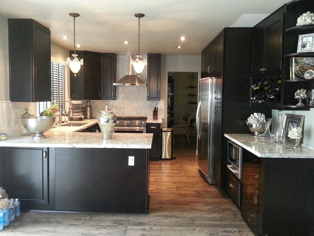
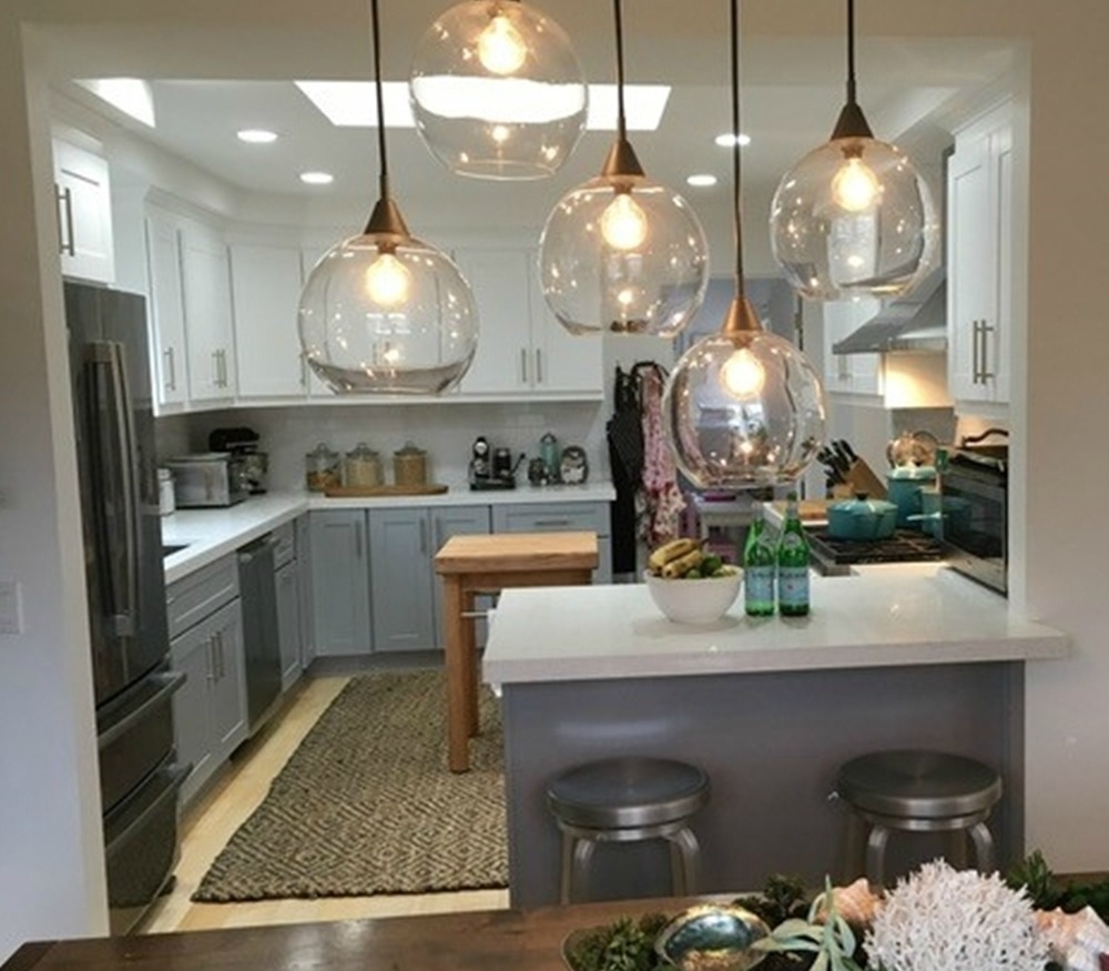
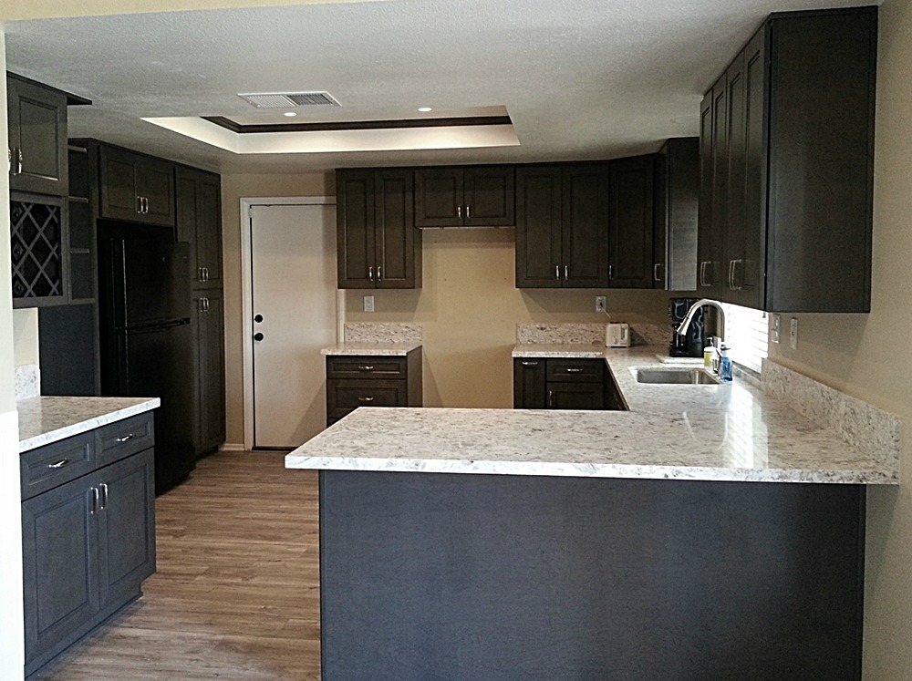
Leather cabinets and Goya quartzite – Removing the connecting cabinets changed this layout from a “U” shape to a galley shape. Removing the upper cabinets on the hood side, and lowering the breakfast bar opens the kitchen to the adjoining dining room and family room. The backsplash runs from the countertop to the bottom of the wall cabinets. The electrical outlets were changed to a power strip, and located to just below the wall cabinets. This allows for no outlet spaces to be cut in the backsplash. Staining the concrete slab throughout ties all the rooms together.
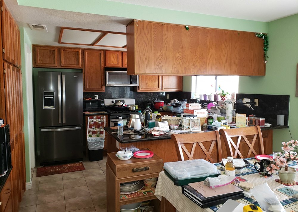
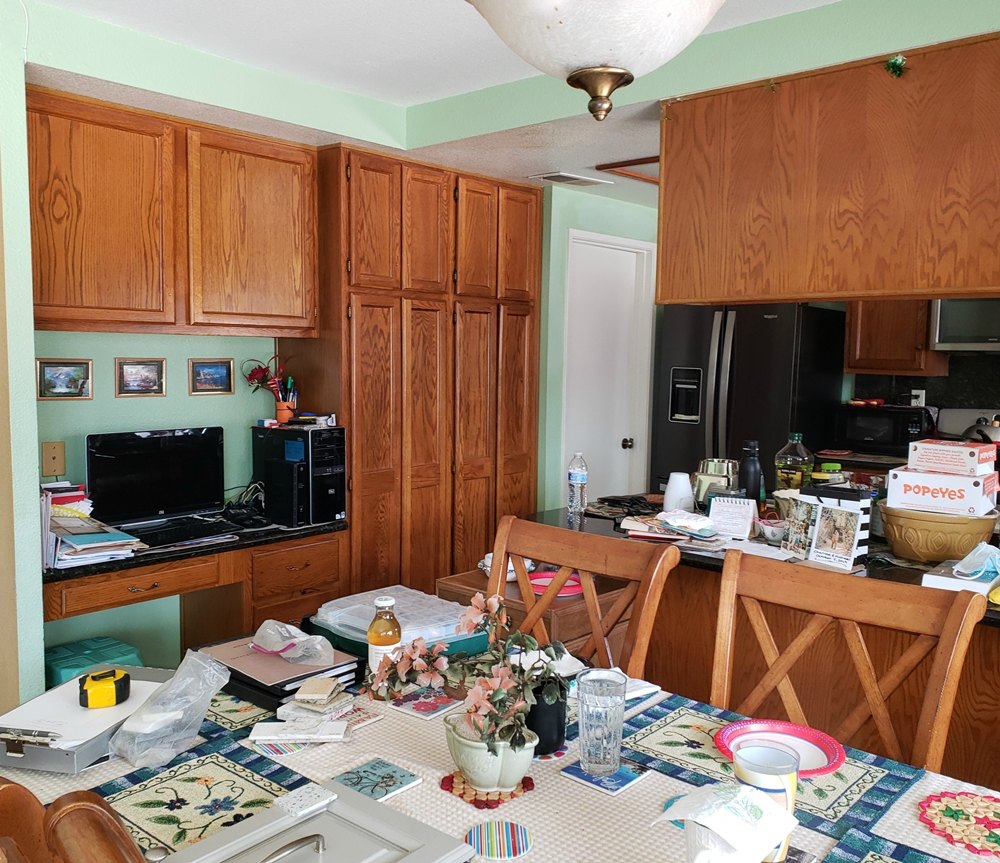
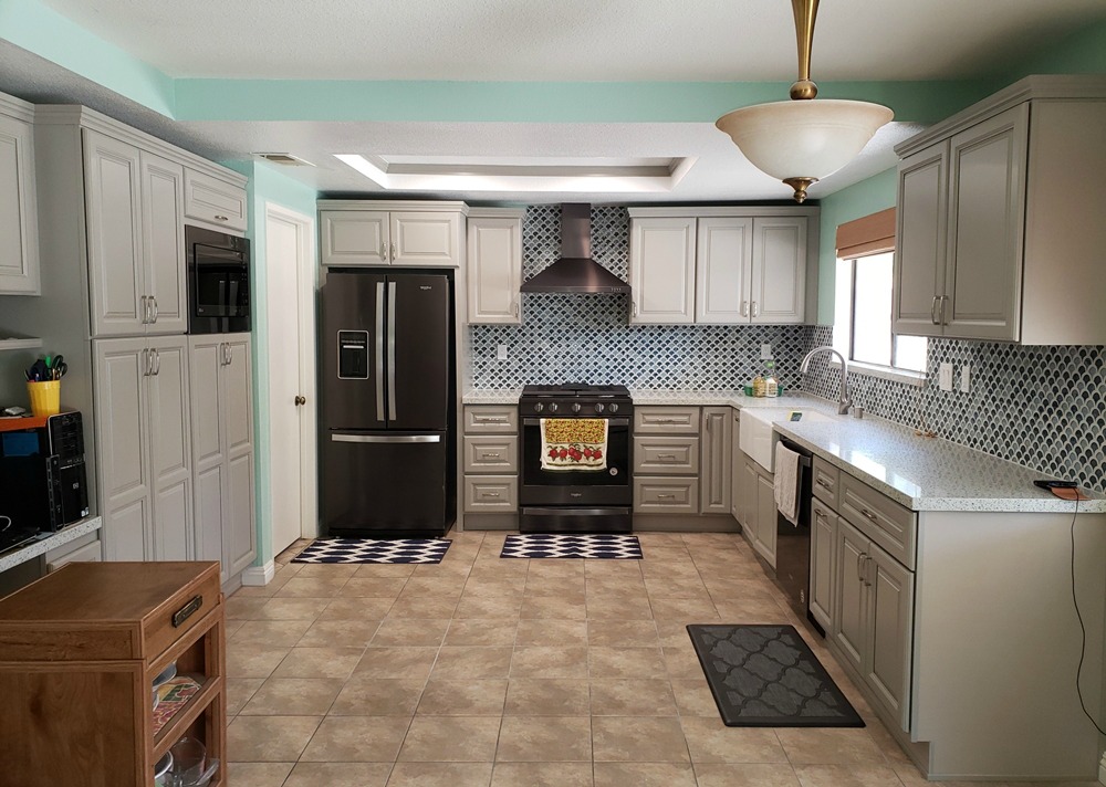
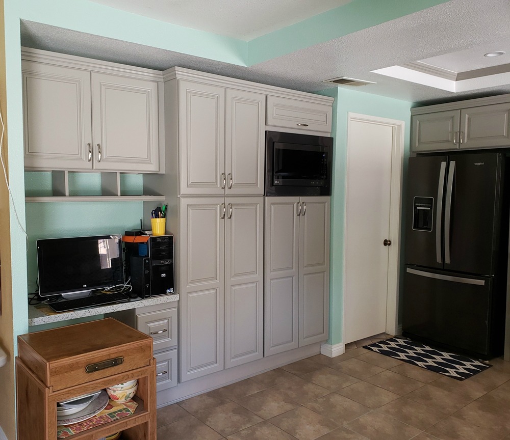
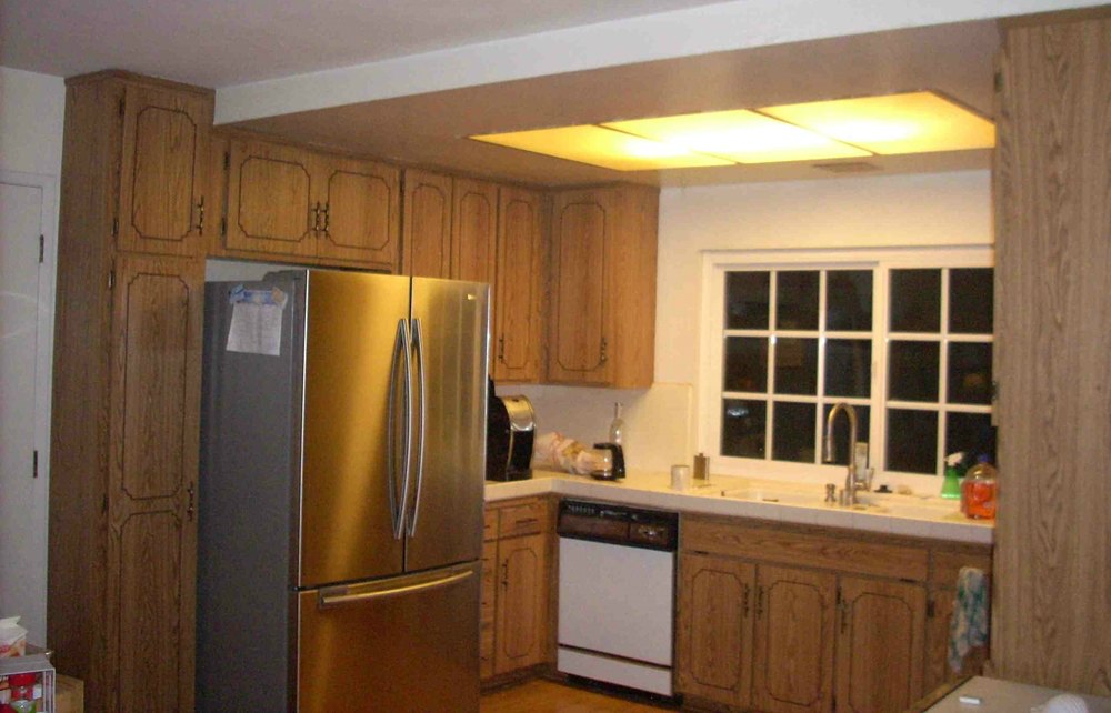
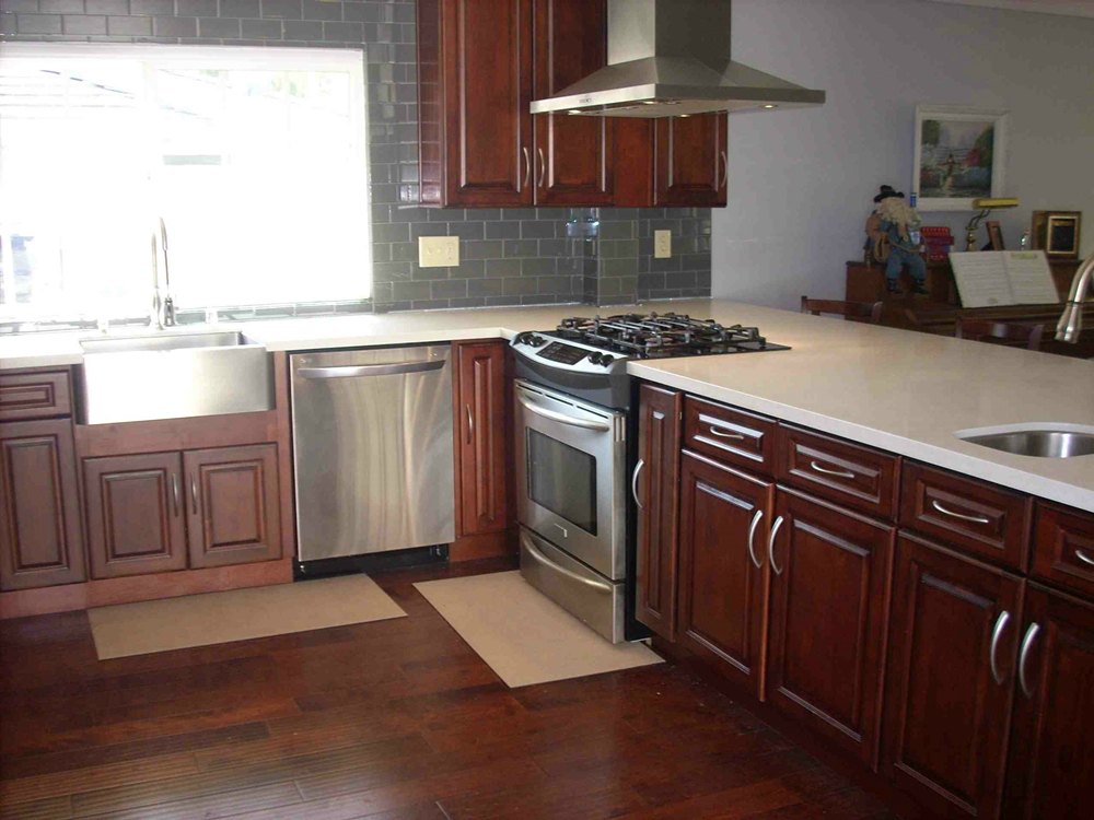
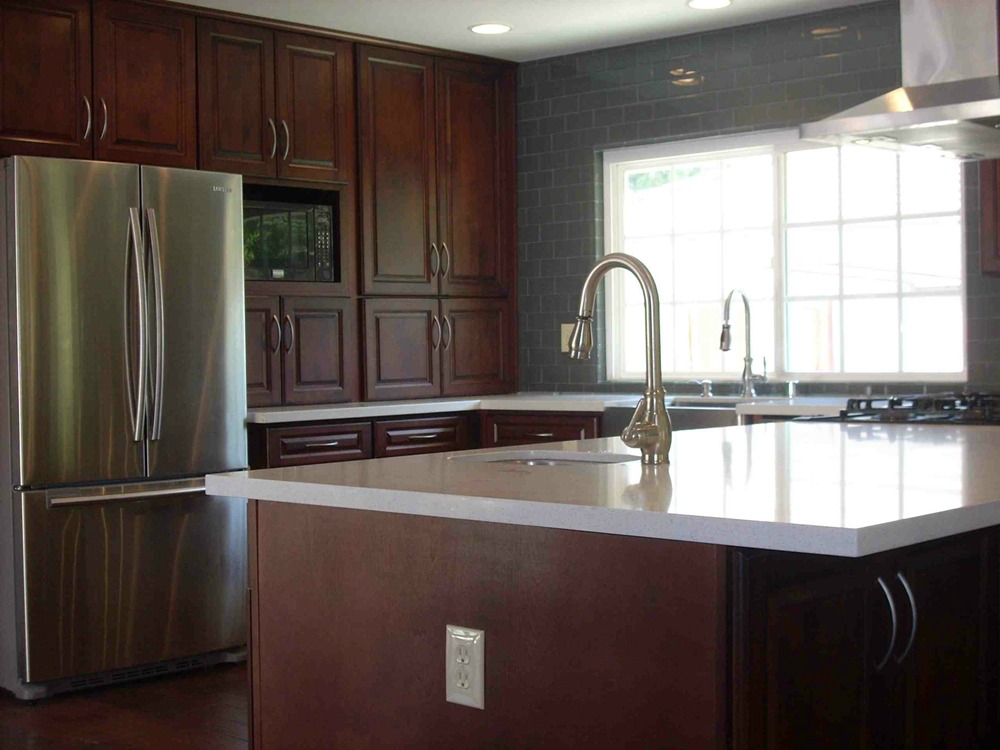
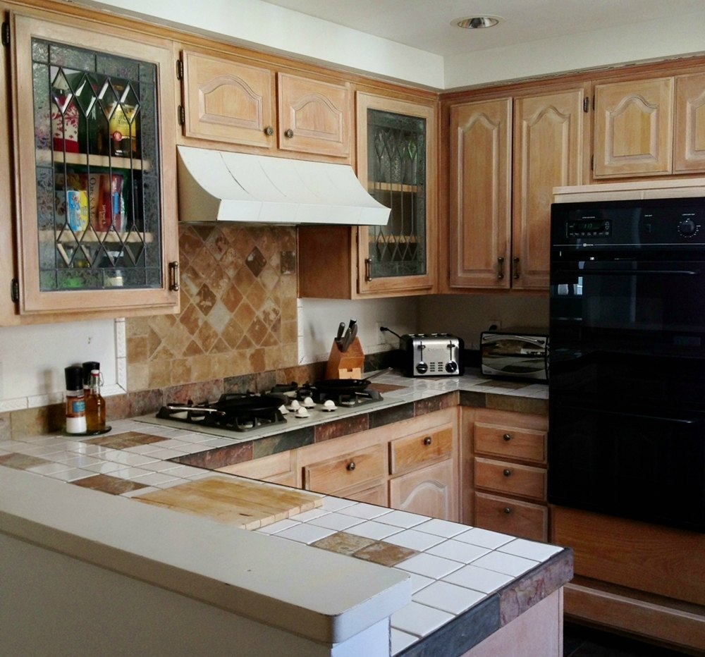
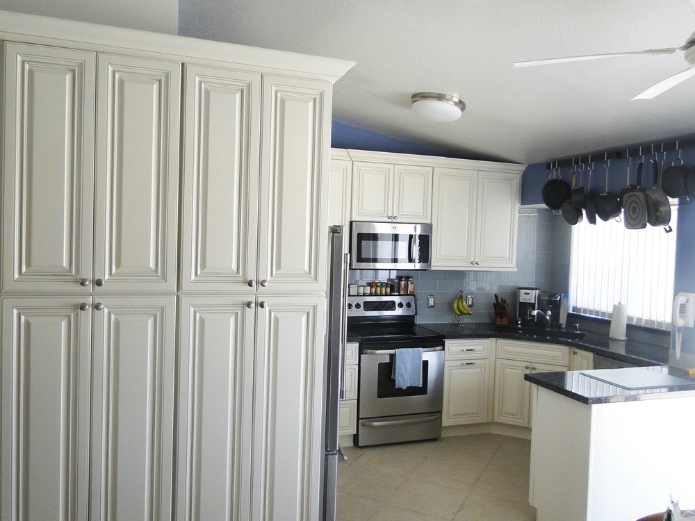
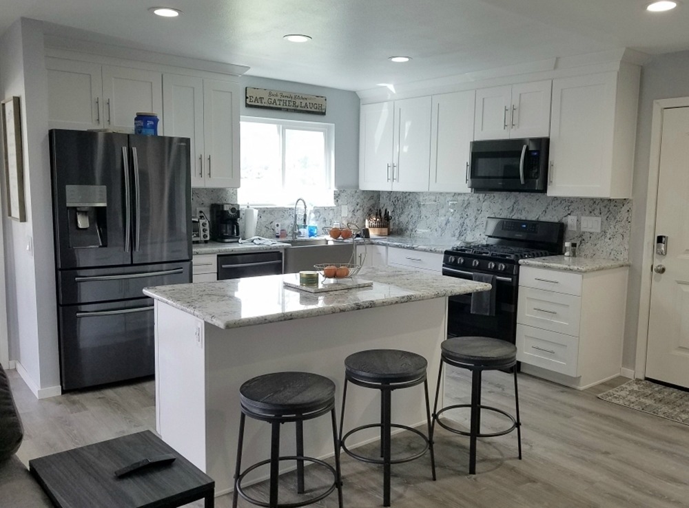
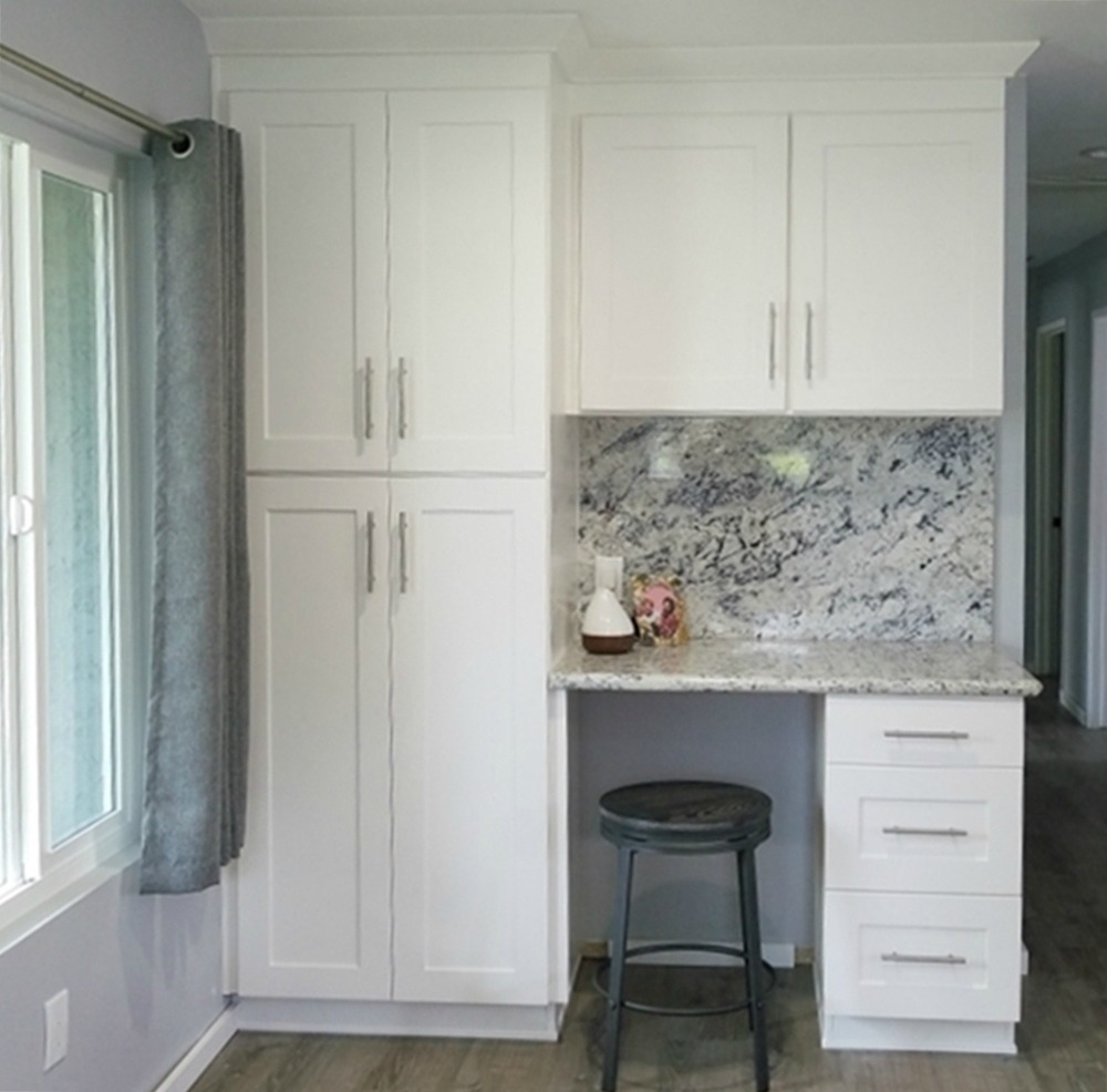
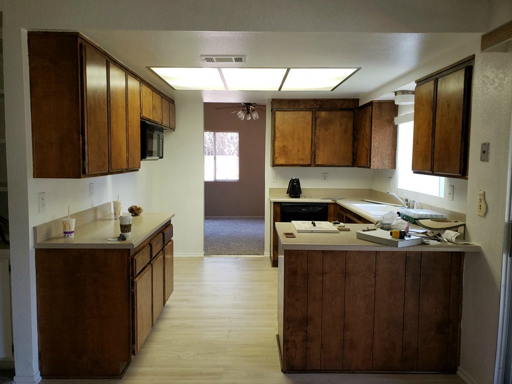
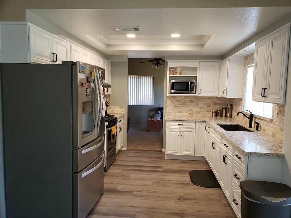
Light Gray Traditional cabinets and Marsala quartz – This original 1940s kitchen had the corner sink typical for that era. This results in a lot of unusable space and windows which are hard to reach. By relocating the sink and window to the back wall, we were able to solve those issues as well as have space for a dishwasher. The laundry area in the kitchen is another typical feature of that time period. By relocating the washer and dryer to a covered back porch, we were able significantly increase the storage space with two pantries. Moving the range to the adjacent wall allowed for countertop and storage space on both sides (which the old range lacked). Utilizing the countertop quartz as the backsplash material results in a smooth surface with no grout to clean.


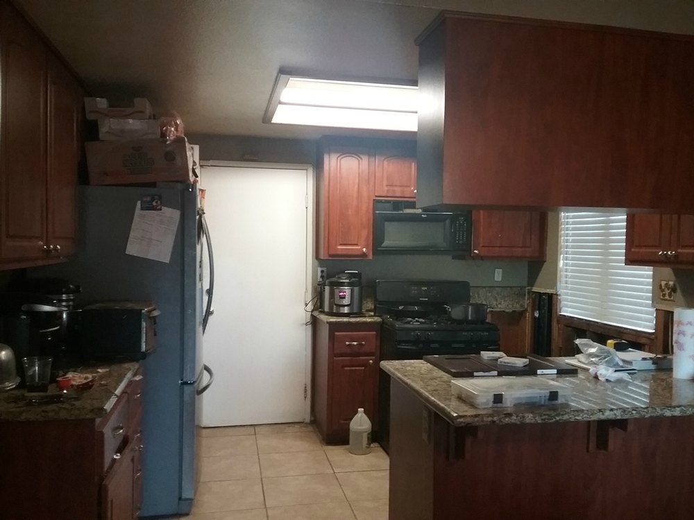
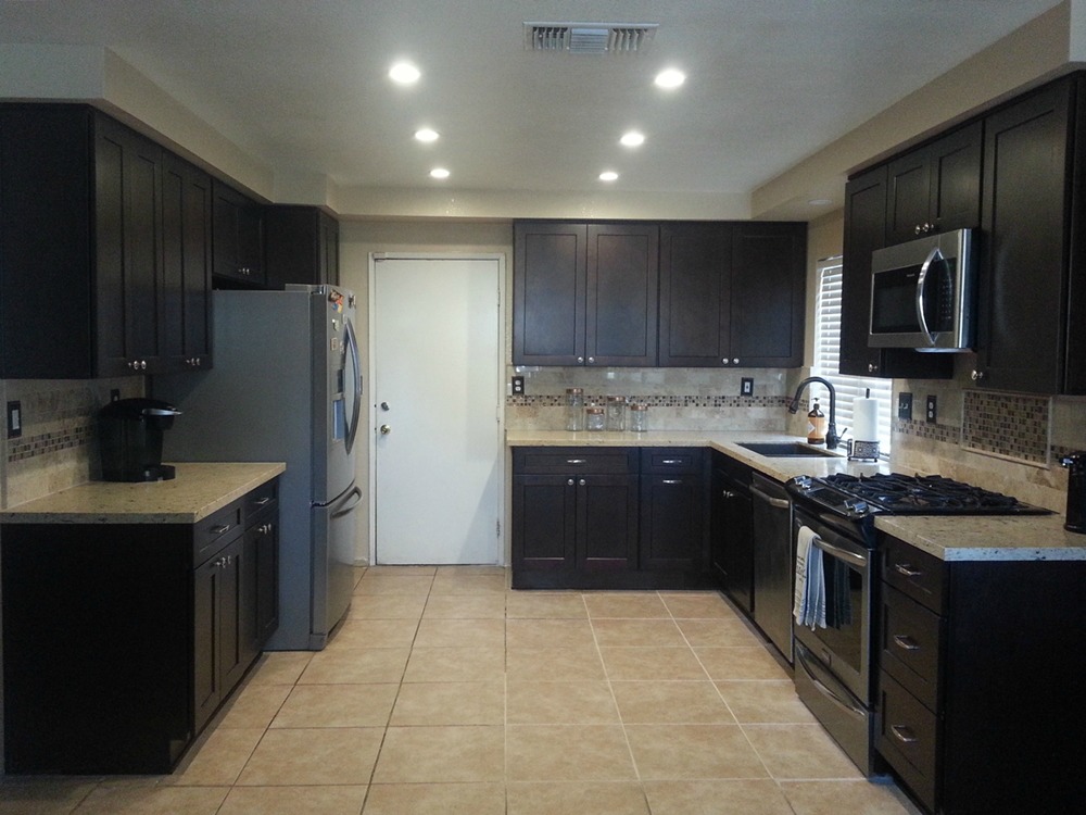
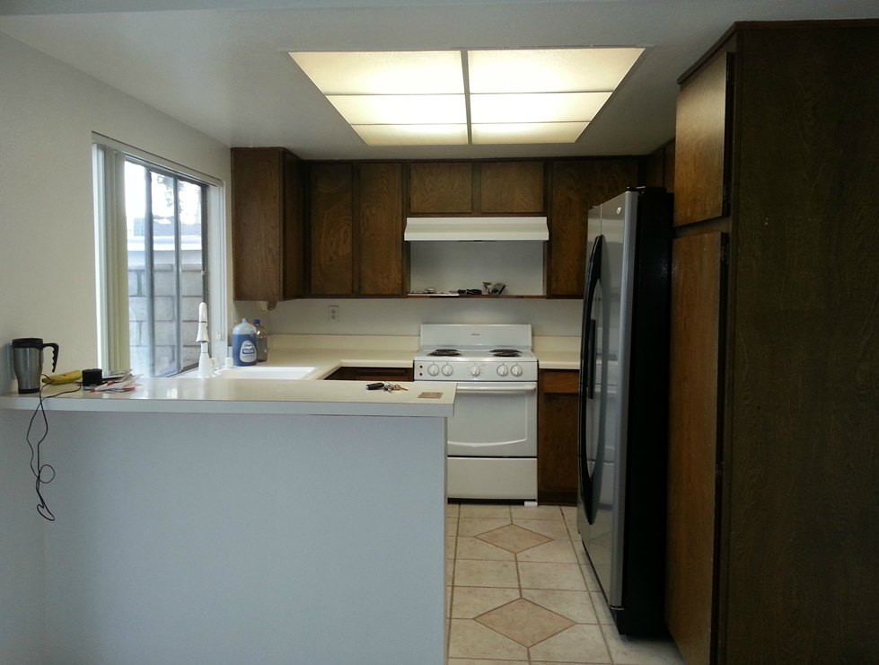
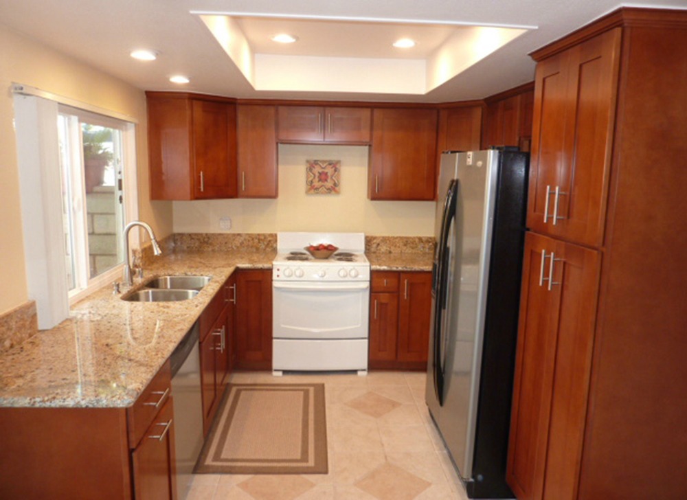
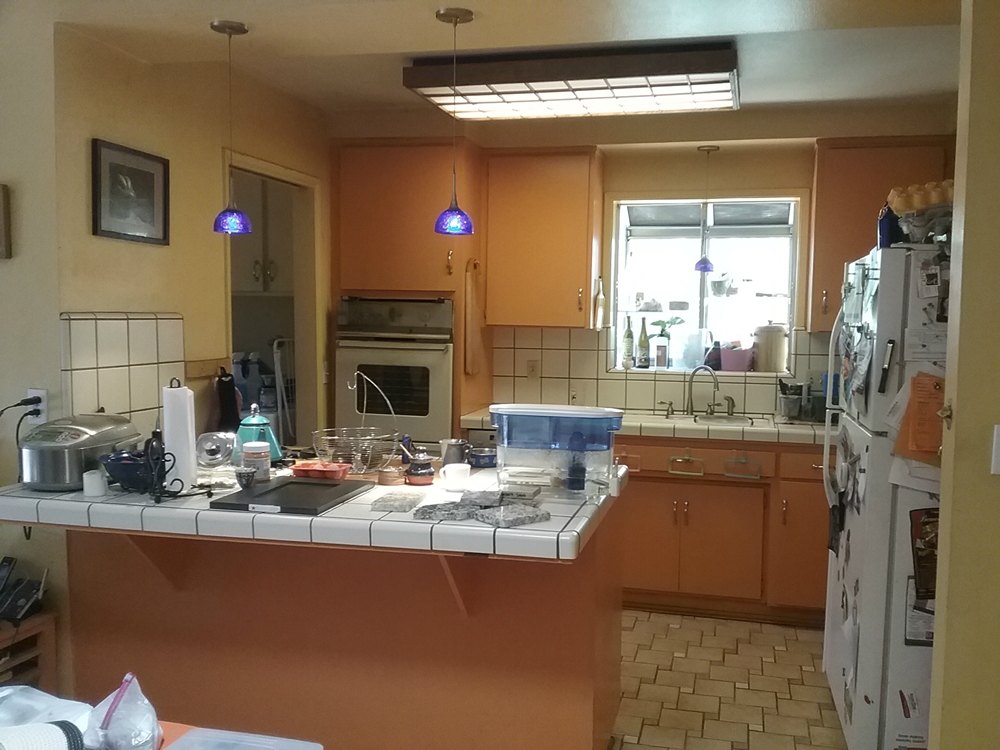
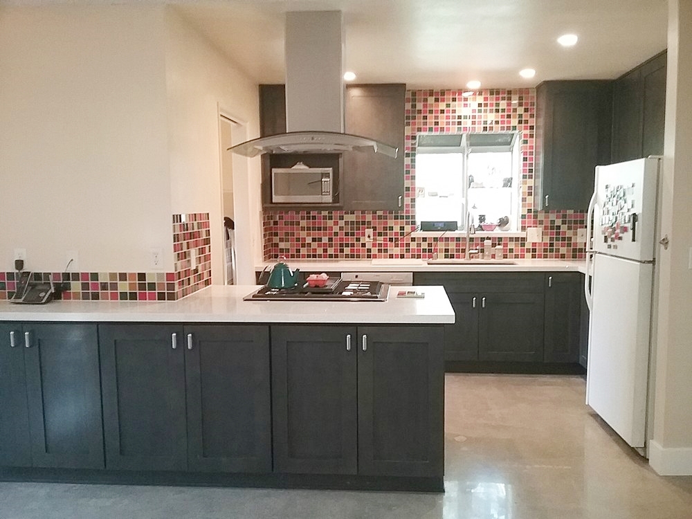
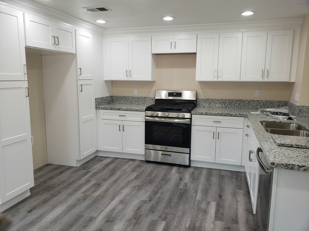
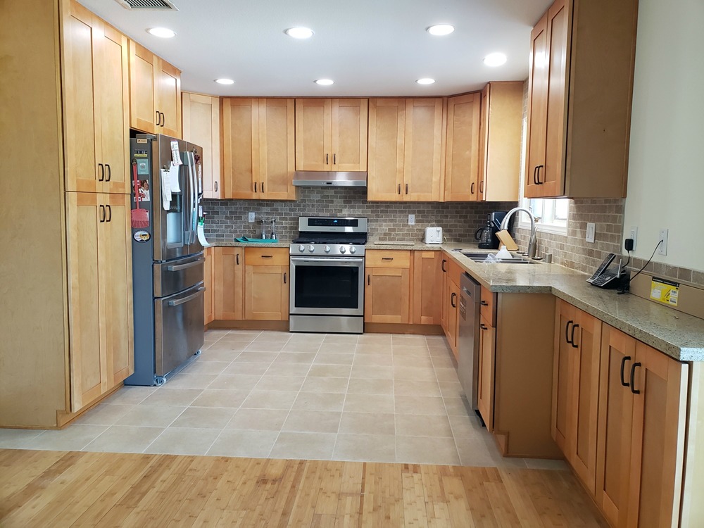
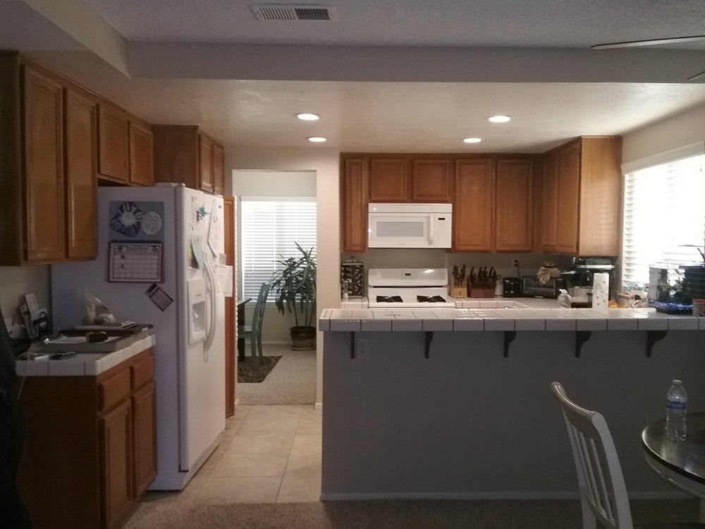
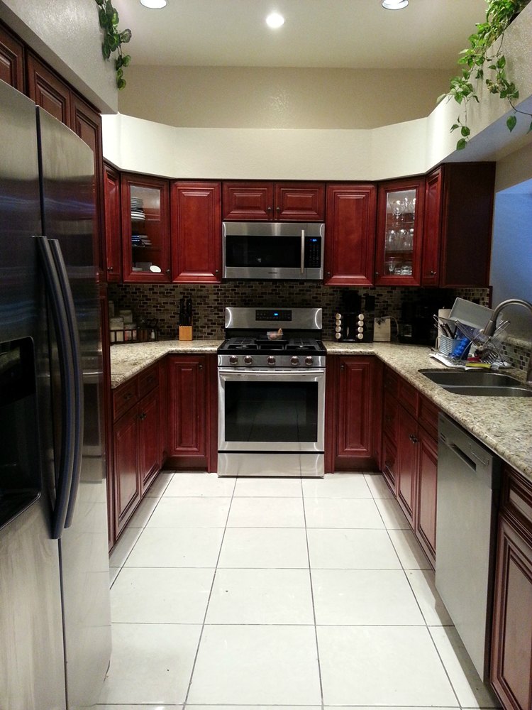
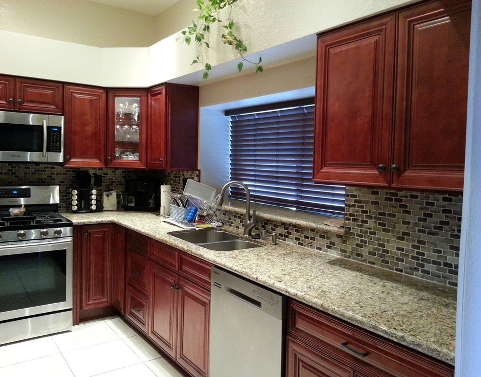
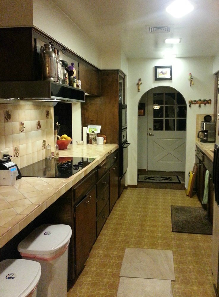
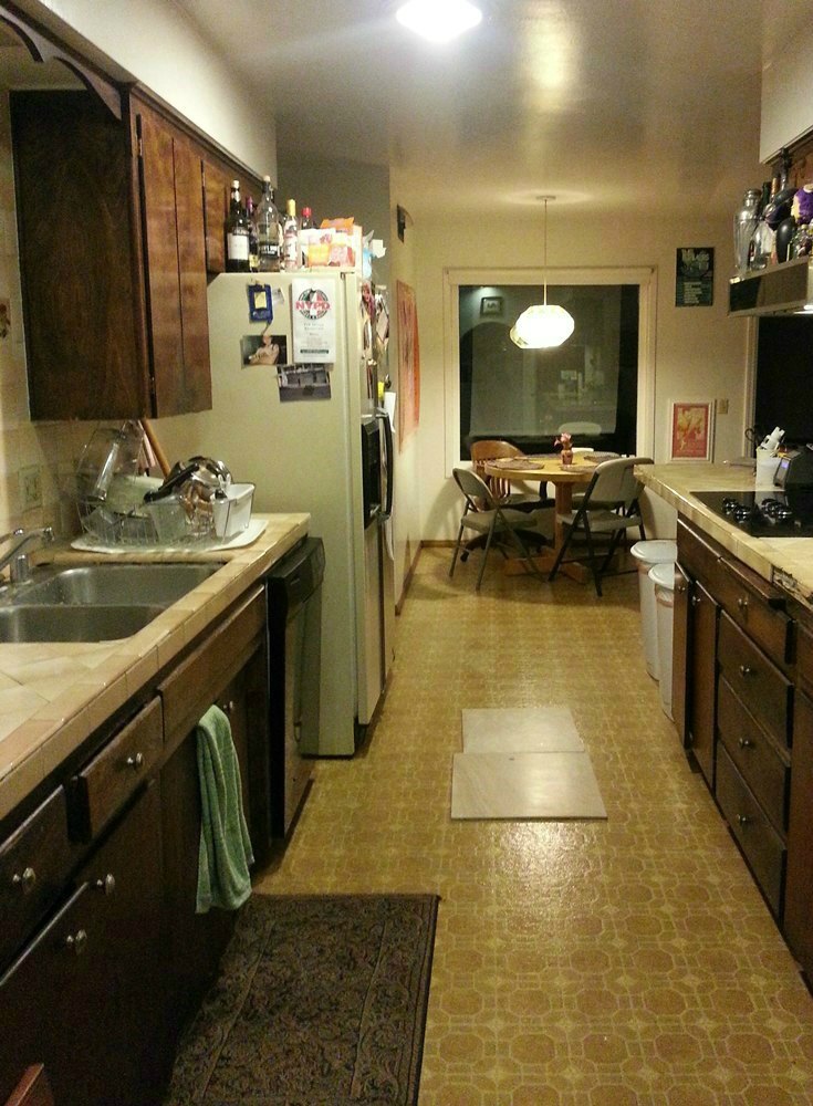
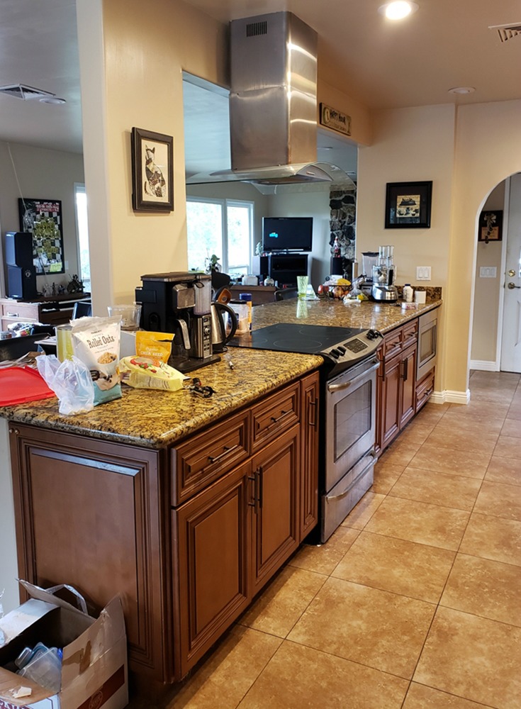
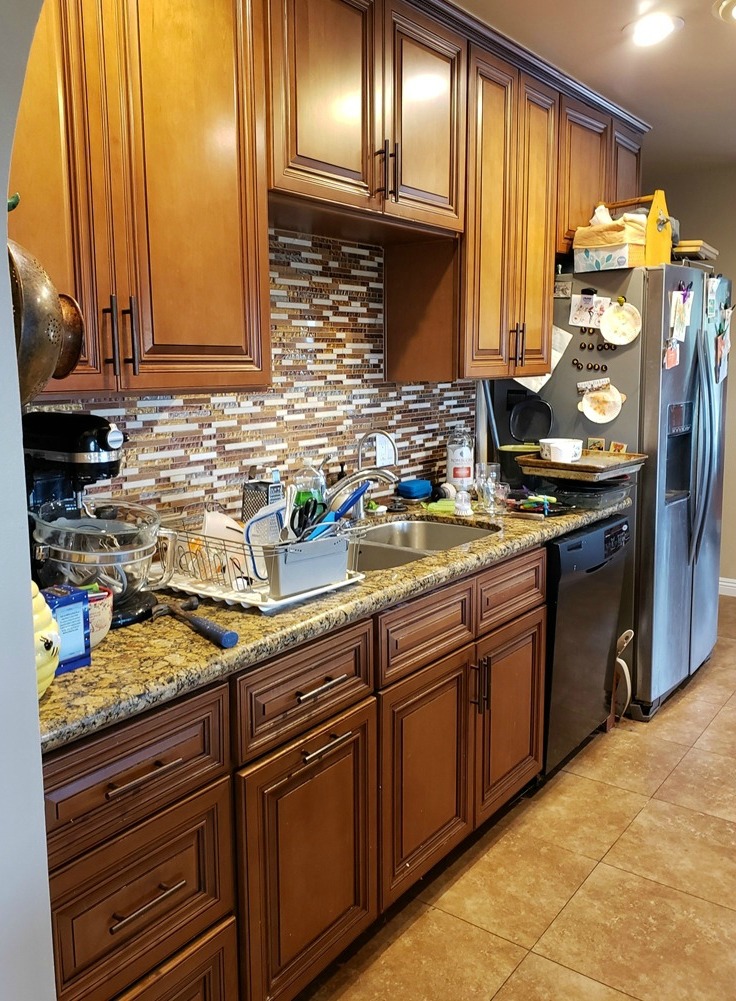
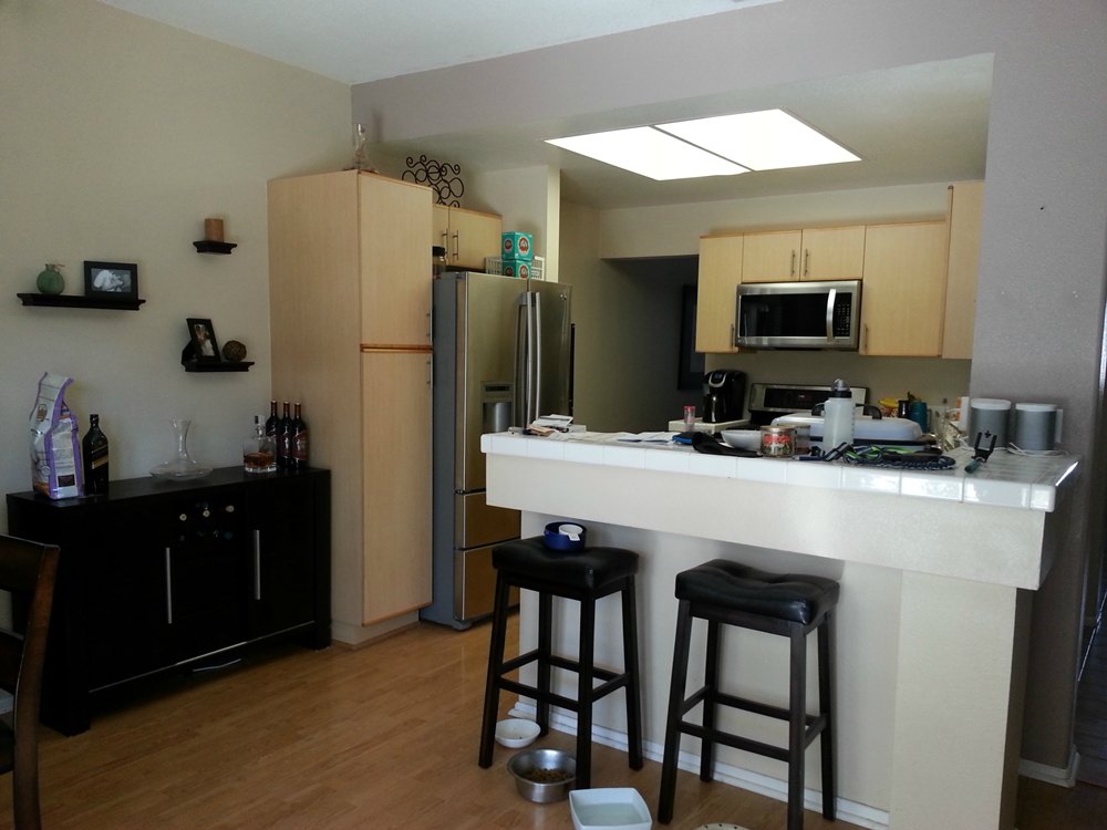
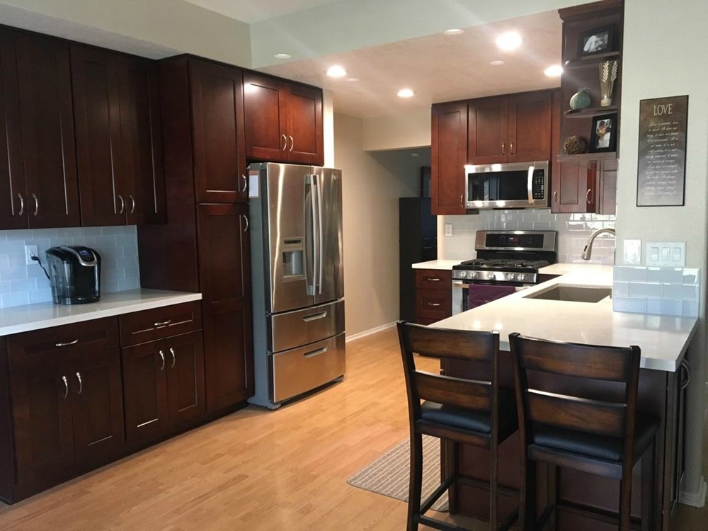
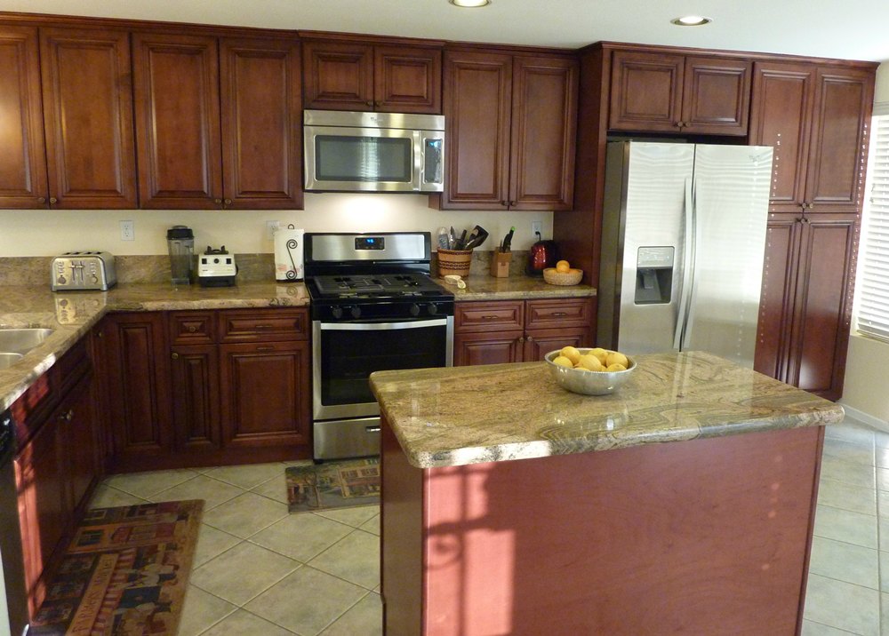
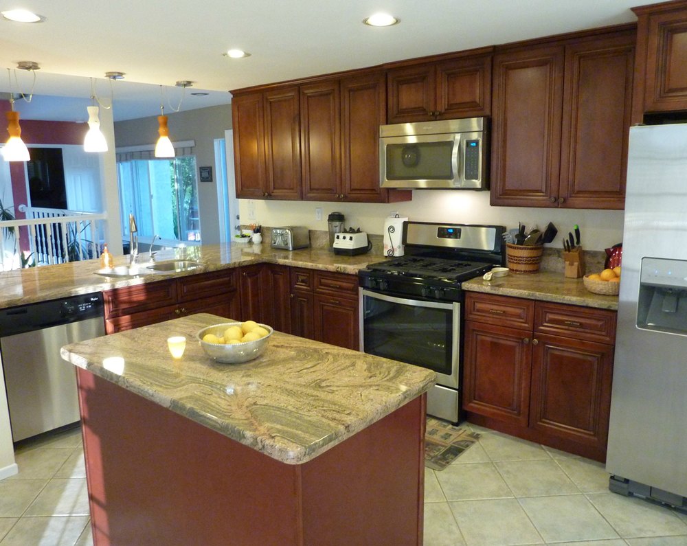
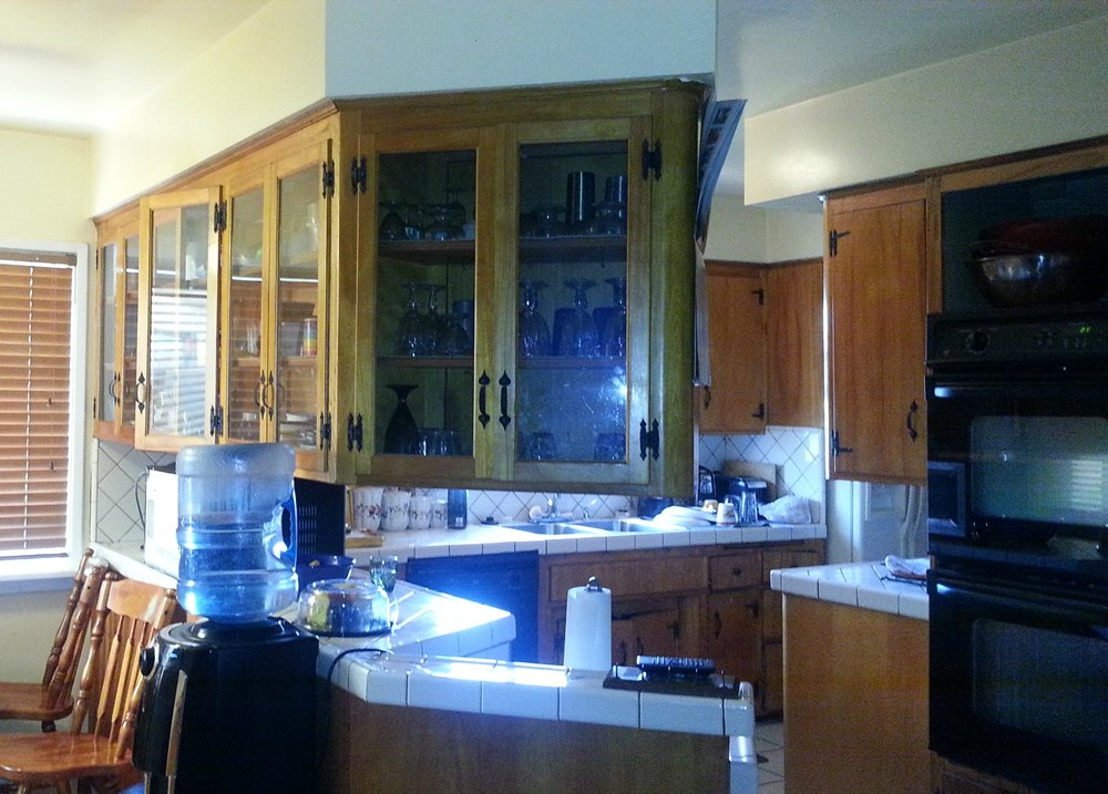
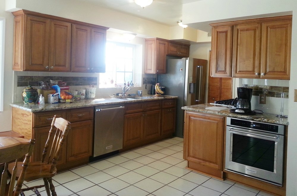
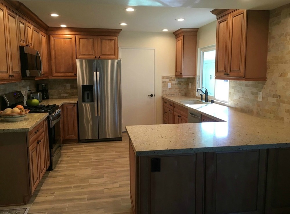
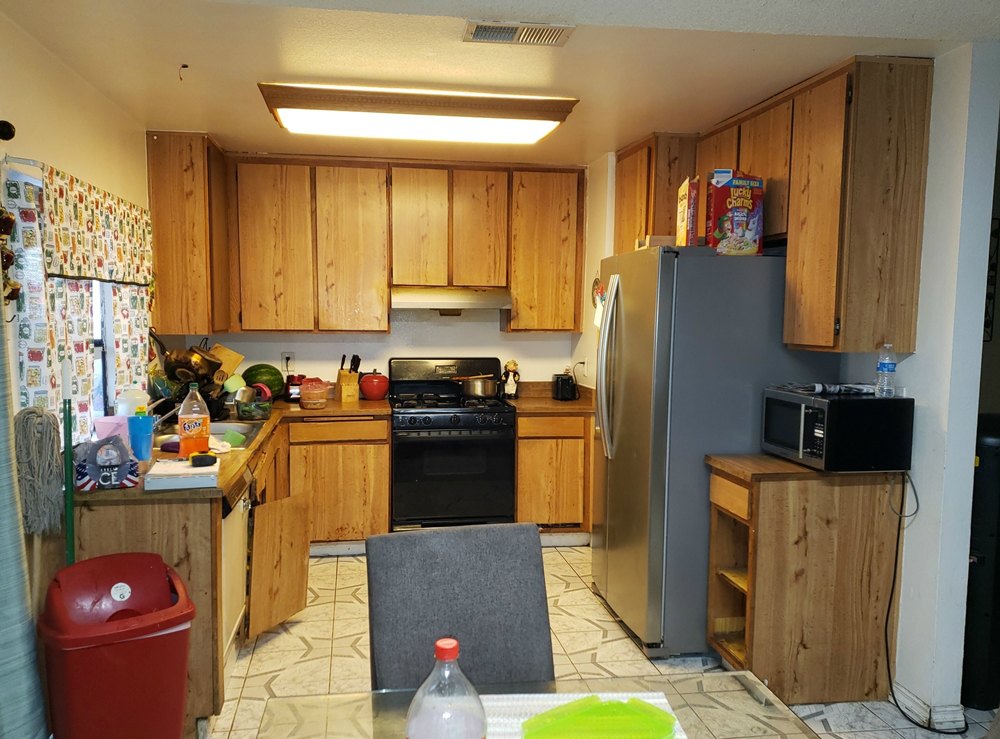
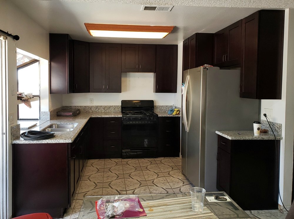
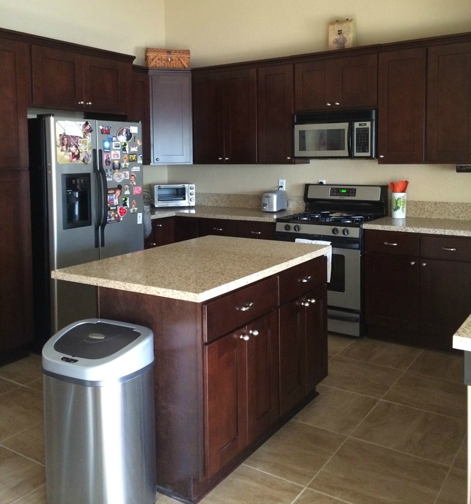
Cocoa Shaker cabinets and Cashmir quartz – The original builder designed kitchen had a small “U” shape with the stove and sink at right angles to each other. The “U” was so small that only one person at a time could be working in the kitchen. Removing the under used peninsula and relocating the stove now allows for multiple cooks. Raising the center of the ceiling allows the kitchen to flow into the adjacent dining room making both rooms appear larger.
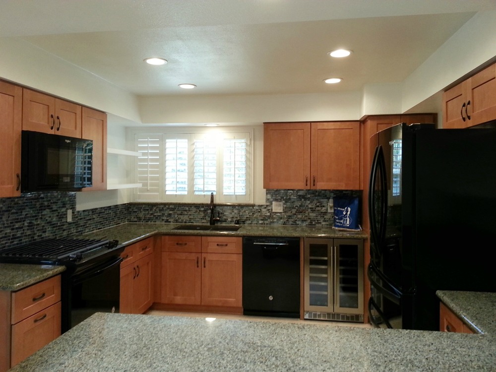
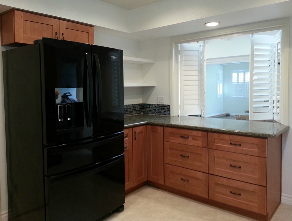
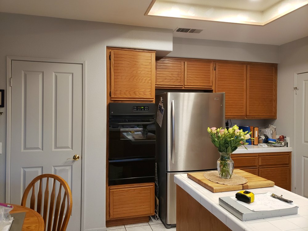
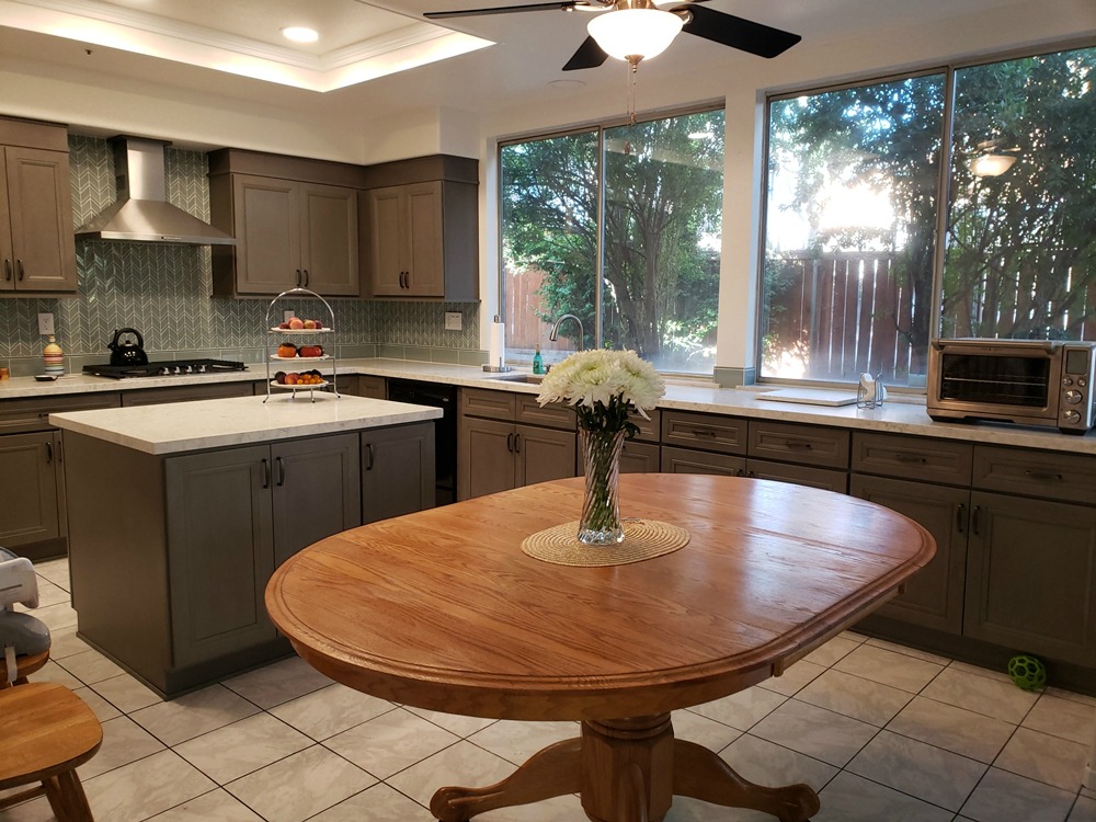
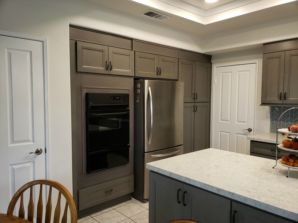
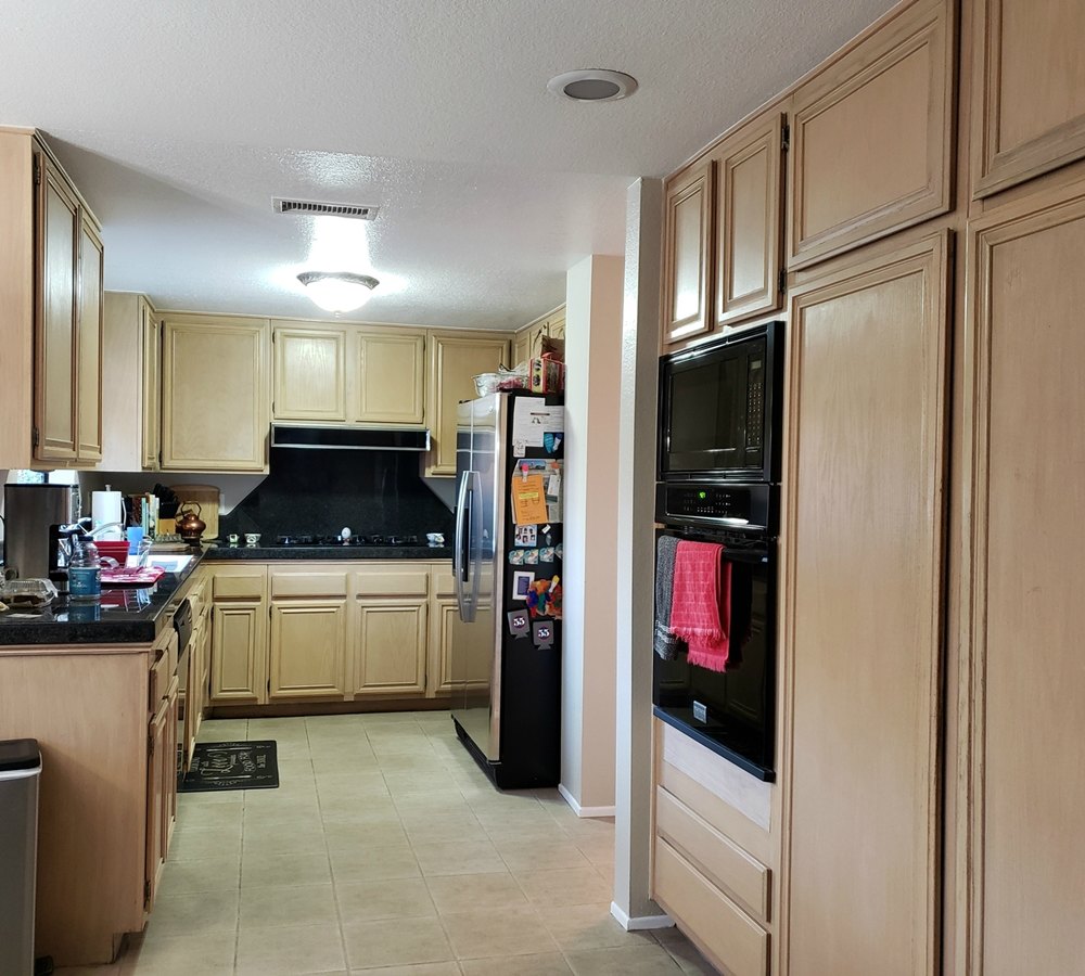
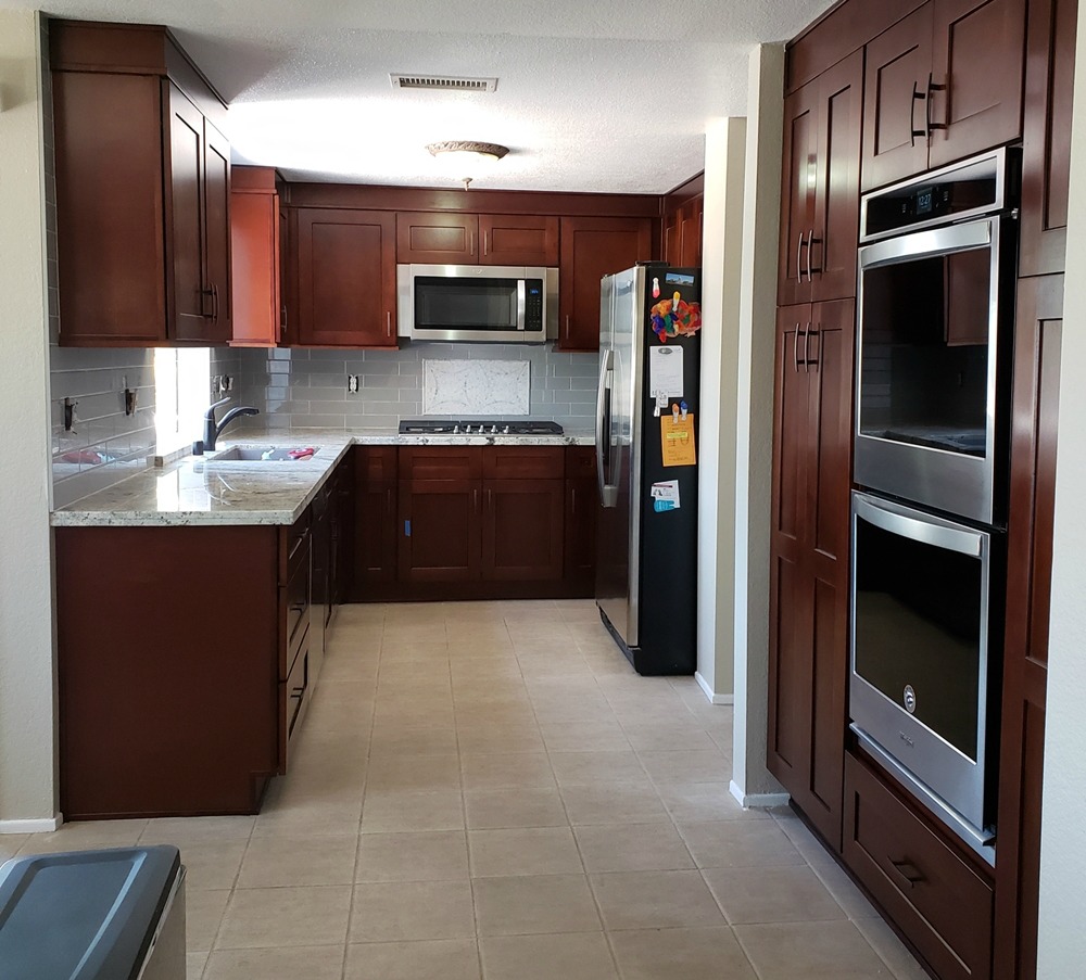
Platinum cabinets and Calacatas Gold Premium quartz – The original builder kitchen featured a small “U” shaped work area, and a refrigerator space which blocked the garage door. The ceiling was also lower than the adjacent dining room. We raised the ceiling to make the two spaces flow better together, and replaced the center recessed fixture with can lights. By removing the peninsula and replacing it with an island, we were able to open up the small “U” area for multiple cooks. We relocated the refrigerator to the center of its wall (which resulted in it no longer blocking the door). We doubled the pantry storage space by placing a pantry on each side of the refrigerator. This gave a home to the old peninsula items as well as additional stroage space, and helped to frame in the refrigerator for a built-in look. We also replaced the standard drawer / door cabinets with drawer stacks. They increase organization and functionality. The countertop material was also placed on the wall to eliminate the grout, and bring in some movement without being too busy.


Dark Honey Shaker cabinets and Africa Persa granite – The original breakfast bar was too narrow to sit at comfortably and stools blocked the patio door. Removing the breakfast bar allowed us to extend the cabinets and countertop, and it did away with the kitchen entry “pinch point” (between the old breakfast bar to the pantry). Exchanging the old recessed light fixture for a new “light box” adds ceiling interest.
Sage Green and White Shaker cabinets and Brown Fantasy dolomite – The original kitchen was in a “U” shape with a breakfast bar and lowered overhead cabinets. This created a tight squeeze point getting into the kitchen. Since the kitchen is adjacent to the small dining area, the breafkast bar was seldom used. By reorientating the “U” shape, we were able to open up the kitchen to the adjacent dining area. This allows the owners space to open their dining table with the additional leaves when company comes over. By exchanging the wall oven and cooktop for a single unit, we were able to regain the cabinet and countertop space that had been on the peninsula. The horizontal handles on the lower cabinet doors indicate a pull-out insert (in this case they were for trash, spices, and cookie trays). For some reason, the builder had stopped the dropped ceiling two feet from the end of the hall wall (you can see this next to the old pantry). By extending the dropped ceiling so that it lines up with the hall wall, we were able to gain two extra feet on the pantry wall. This allowed us to exchange one of the pantries for the refrigerator, which no longer intrudes into the kitchen walking space. The new countertop has browns, creams, grays, and greens which ties together the kitchen colors. Using tile around the window and built-in bookcase adds a touch of playfulness to the room, and avoids narrow painted areas.


Natural White Oak Shaker and Maruggio Gold quartz – The original 50 year old kitchen was showing its age (even after having been painted at least once). The new owner wanted a more modern cabinet and countertop style. We replaced the traditional cabinets with Shaker style, and the granite with quartz. The cabinets on the back side of the peninsula face the dining area. The shallow drawers were replaced with full height doors for better storage. The cabinets now go all the way across the back side instead of one cabinet which faced the walkway (and blocked the entry to the kitchen when opened). The new flooring and recessed can lighting complete the modernization.


Coral Shaker cabinets and Silversea Green granite – Replacing the cooktop and wall oven with a free-standing range allowed for a pantry to be installed in the old wall oven location. An awkward lowered breakfast bar which faced into the dining room has been replaced by a full height bank of drawers for much needed storage and countertop space. The opening remains (although raised up) to allow light and conversation to flow between the two rooms. The dropped ceiling light fixture was replaced with can lighting to give more head room. Open shelves in both corners of the room allow for easier access to the corner locations. The 1950’s all white sterile kitchen scheme has been beautifully replaced with the natural colors of sand, coral, blue, and green.
White Shaker cabinets and Zircon Blue quartz – The builder had designed this kitchen to be a simple galley shape. But when the dishwasher was opened, you could not open the refrigerator. And when the pantry was open, it was difficult to get into the kitchen at all. By shortening the breakfast bar counter, we were able to wrap cabinets in an “L” shape to add extra storage. This turned the original peninsula into an island. By moving the pantries out of the way of the main kitchen, we were able to enlarge the pantry storage. We added a desk at the end of the run, and a glass door cabinet above for some display space. Both the countertops and the backsplash have bits of blue which work nicely with the new light blue walls and the gray floors.
Royal Blue Shaker and White Shaker cabinets and Calacatas Glacier quartz – The original kitchen had the dark wood cabinets, white tile countertops, and cabinet soffits that were typical of its construction time. The owners decided that it had served them well, but it was time to modernize the space. Removing the ceiling soffit allows for taller cabinets with more storage. Changing the dark wood cabinets for bright white and blue makes the kitchen more inviting (and a bit playful). Replacing the tile counters with quartz eliminates cleaning the grout. The pantries were reduced from the standard 24 inches to 12 inches deep. This depth allows for the storage of most items, while not infringing into the dining space. It also allows the top pantry doors to align with the other wall cabinets for a sleak look. To further accent the blue cabinets, a white quartz with blue veins and a dark blue sink were used. The tile backsplash incorporates whites, blues, grays, and bits of silver to tie all the kitchen elements together.


Gray Shaker cabinets and White Sparkle quartz – Removing the perimeter soffit allowed the new cabinets to go up to the higher ceiling for more storage. The cabinets along the backside of the peninsula (they run the entire wall length) add additional storage. Exchanging the old wall oven and cooktop for a new slide in range increased the countertop space, and the microwave is now off of the countertop. The island chimney hood provides for better ventilation. The stained concrete floors, recessed can lights, and Shaker cabinets add a modern look. The brightly colored tile backsplash makes this a child welcoming space for young chefs.
Sage Shaker and Marshmallow Cream cabinets with Calacatta Phoenix quartz – The original kitchen felt closed in due to the dropped ceiling and the four walls. The adjacent breakfast area was redundant since there was also a formal dining room. By removing one wall and raising the ceiling, we were able to combine the two spaces into one larger kitchen space. We were able to move the upstairs plumbing (which had been in the dropped ceiling) to the perimeter of the room. This allowed the center of the room to become the same ceiling height as the adjacent rooms. The new island serves as an additional eating area function while also providing additional storage. The flooring now matches the rest of the house which also removes the visual kitchen separation. Replacing the old ceiling fixture with can lights (both in the ceiling and in the cabinet soffit) brightens up the combined space. The glass chevron backsplash adds some detail interest, and ties together the various colors used in this kitchen.


Dark Cherry Shaker cabinets and Fire Bordeaux granite – We started this refresh by replacing the old partial overlay oak cabinets with a modern full overlay Shaker door style. By replacing the original wall oven and cooktop with a free-standing range, we were able to give the homeowner more countertop and cabinet storage to the left of the refrigerator. The microwave was placed over the stove to free up more counter space. On either side of the range are organizational pull-outs, and there is now a lazy susan in the corner to make that storage space more accessible. The plain white tile countertop and backsplash have been replaced with a colorful granite and pale green tile backsplash.


Chaparral and Magnolia cabinets and Calacatas Phoenix quartz – Oftentimes, clients are in a rush to remove as many walls as possible. In this case, we actually added some additional wall. Although it made the walkway into the dining room more narrow, it allowed us to relocate the refrigerator and add a pantry. Additional countertop and storage was added to the right of the stove (where the old refrigerator had been). The new cabinets are a combination of light oak and white recessed panel cabinets. The new quartz countertop is white with light brown veins. The quartz countertop is also placed in the backsplash area for a modern look with easy maintenance.


Moscato cabinets and Latte quartz – The original kitchen had a small prep island facing the stove. This allowed for a very small table and chairs in the kitchen. By turning the island 90 degrees, were we able to get a larger island which now has space for an eating overhang. The microwave has been relocated from over the stove to under the counter in the island. The ligher colored raised panel cabinets and larger crown molding give a more traditional formal feel to this kitchen.


Cream Shaker cabinets and a Sage Shaker island with Calacatas Venata quartz – This small house had a main area divided into a small kitchen, a small dining room, and a living room. By removing the wall and replacing it with a new beam, we were able to open all the spaces to each other. The wall had not only created awkward room dimensions, but also stopped air and light flow between the spaces. Now, people can sit in the dining room and look out the kitchen window. The original sink faced a wall, and the original stove had sided to a wall with only 12 inches of countertop space on the other side. By replacing the original window with a shorter one, we were able to create more space underneath which allowed us to move the sink to be under the window. Once the sink had been reloctated, we were able to make the rest of the kitchen more efficient. Now, the sink has countertop space on both sides and the stove has countertop space on both sides. The narrow cabinets on the sides of the stove contain pull-out racks for holding spices and other small items. And a pull-out trash can now resides to the left of the sink (which eliminates the can sitting out on the floor).


Cocoa cabinets and Pepper Gray quartz – This older home only had a small bit of countertop by the cooktop (behind the pony wall) and the countertop by the sink. It was a small and awkward working space. We removed the wall behind the cooktop and the dropped ceiling over the kitchen. By making the ceiling height the same as the adjacent dining area, we were able to extend the cabinets into the dining area in order to enlarge the kitchen. The new kitchen has double the counter and storage space. As well as an apron sink and an under counter microwave. The additional storage eliminated the need for the old shelving units which were originally placed along the dining area walls. Thus, although the dining area is slightly smaller, the useable space is similar.


Snow Traditional cabinets and Crystal Coffee quartz – Opening the wall between the kitchen and dining room allows the kitchen to share in the dining room’s great backyard views. Arching the tops of the openings duplicates the arches found in the rest of the house. Changing to a simple white and gray color scheme brightens the space, and adding a multi-gray glass backsplash tile keeps it from looking too sterile.


White and Sable Shaker cabinets and Black Pearl Leather granite – Removing one leg of the original “U” shaped kitchen allowed the space to place an island in the center and open the kitchen to the family room. The corner sink was relocated to the exterior wall to allow for better storage utilization of the corner. The narrow opening into the dining room (on the other side of the refrigerator in the before photo) was doubled to allow a better visual connection between the rooms. The microwave was moved from over the stove to under the countertop which allowed for a chimney hood focal point. The backsplash tile runs up around the windows for a seamless look.
Cobblestone cabinets and Calacatas Phoenix quartz – By expanding the kitchen into an unused dining area, we were able to double the amount of cabinet space and countertop. Removing the cabinets over the old stove extends the views into the living room. Relocating the stove allowed for more working space on either side. The eating bar is now all one level which increases its functionality.


Java cabinets and White Spring granite – While the medium colored flooring remained the same, the kitchen became more formal with dark cabinets, white veined granite, and a marble backsplash. The original hood was exchanged for a chimney hood, and the appliances were upgraded to stainless steel. The large pantry was split with half on each side of the refrigerator. An entertaining area was created to the right of the pantry by placing the microwave and a bar fridge under the counter, and putting a wine rack above.

Cordovan cabinets and African Canyon granite quartz – By removing the old breakfast bar and stove peninsula, the kitchen is now fully open to the adjacent family room. The stove was relocated to the exterior wall (which allows for easy venting), and a microwave vent can now be placed on top. The lower cabinets now wrap around the corner which allows for a mini-fridge to face the family room. The “L” shaped cabinets to the left of the sink were removed. Since the cabinets to the left of the sink now go straight to the wall, the opening to the dining room was able to be enlarged. The storage space that was lost by the layout change, was gained by the new cabinets to the left of the refrigerator. The new hexagonal backsplash is brought up around the window for a colorful focal point.


Saddle Shaker cabinets and White Persia granite – The original window was too low for cabinets underneath, and the alcove was too shallow to allow for a table without sticking out into the walkway. Raising the window allowed for a seating area and additional kitchen storage. Lowering the breakfast bar helps tie together the kitchen and family room. Moving the refrigerator to the end allows for a larger pantry. Replacing the light fixture with a “light box” gives visual interest to the ceiling.
Thunder cabinets and Montgomery quartz – Removing the wall cabinets suspended over the peninsula opens the kitchen to the adjacent family room. Frosted glass in all the wall cabinets lightens up the dark gray cabinets. The old wall oven (which was located in the brick wall on the right side of the photo) was replaced with a pantry. A multi-light chimney hood provides a contemporary focal point.
White Shaker cabinets and Pauline Gray granite – This kitchen originally had a large pantry on one side and some small cabinets wrapping around the angled corner. By “boxing out” the awkward corner, we were able to put a pantry on both sides of the refrigerator to give it more of a built-in look. The breakfast bar has been lowered to countertop height for better sight lines into the adjacent family room.
Cobalt Blue and Marshmallow Cream cabinets with Fairy White quartz – The goal in this remodel was to increase the efficiency and modernize the feel without expanding the kitchen footprint. The dropped ceiling was removed to increase the height of the wall cabinets. The center recessed ceiling fixture was replaced with can lights. The refrigerator was moved to the left so that it did not open into the peninsula. The original upper and lower cabinets next to the refrigerator were replaced with a pantry, and the refrigerator was centered between the two pantries. A larger overhang was placed at the end of the peninsual to allow for an additional stool. The dark blue cabinets add a pop of color. And by keeping the taller cabinets in white, the room does not feel too dark.


Marshmallow Cream cabinets with Calacatas Pietra quartz – The owner had decided that it was time to sell this house and felt that the original builder oak cabinets would be a detriment in the current housing market. Thus, we replaced all the oak cabinets with a more modern cabinet style in a lighter cream color. Due to existing plumbing constraints, we were not able to make a lot of changes with the cabinet layout. However, we were able to swap the old blind base cabinets for lazy susan cabinets to make the new owner’s life more convienient.


Dove cabinets and Zircon Whitney quartz – Our three most requested changes are removing the peninsula, removing the cabinets over the peninsula, and changing the recessed ceiling light fixtures to a “light box” with crown molding. This kitchen has all three revisions, and looks so much more open now. There is even room for a future island in the center. The sink wall cabinets were extended past the old peninsula to line up more closely with the pantry wall. The pantries were enlarged to add some more storage, and now have roll-out shelves for extra convenience. The kitchen was further customized with a chimney hood over the range (the microwave has been relocated to the pantry), a farmhouse sink, and a colorful tile backsplash.
Suede cabinets and Calacatas Phoenix quartz – While the clients enjoyed the light brown color of their cabinets and did not want to change the floor, the original kitchen was worn and lacking in many current features. The builder had used short 30 inch tall wall cabinets (in order to save money) and had never placed a cabinet over the refrigerator. The refrigerator “pocket” was narrow, and it was difficult to open the refriteraor fully. We increased the height of the wall cabinets to 36 inches tall and added an extra pantry at the end of the sink wall. Both of these changes resulted in more storage space. We widened the refrigerator space to allow for the doors to open, and placed a cabinet above for storage. The lower corners now have lazy suan cabinets (with turntables) and the upper corners now have diagonal cabinets. Both of these types of cabinets eliminate blindly reaching back into the corners for your items. The new kitchen looks more “finished” now that it has crown molding, under cabinet molding, handles, and cabinets with some decorative highlighting.


Polar Shaker cabinets and Purple Dunes granite – This kitchen had been added onto several times and suffered from an awkward layout with multiple ceiling heights, as well as inadequate storage and countertop space. The original brick wall pass-thru opening between the kitchen and dining room was covered in drywall for a more contemporary look. A mini-fridge and bar overhang were added to create an entertaining space. The brick column (to the right of the pass-thru opening) was enlarged and covered in drywall to provide space for the new stove and surrounding cabinets. The cabinets on the sink wall were extended to provide space for a pantry and much need countertop space.


Shell cabinets and White Cloud quartz – While the new owner was happy with the layout, the old distressed cherry colored cabinets and pink/orange granite needed to be changed. The new pale gray cabinets lighten up the kitchen, along with the white and gray counters.


Graphite cabinets with Yellow Butterfly granite – Although this Great Room had cathedral ceilings which should have given the space an open feeling, the Builder had placed a lowered ceiling section over the kitchen corner. This resulted in everyone wanting to duck when they went into the kitchen. By removing that ceiling section and using the same flooring throught the space, this Great Room now feels like one large space. Since there is a dining area adjacent to the kitchen, there was no need for a breakfast bar overhang. This allowed us to place cabinets on the backside of the island (in place of the stools) for extra storage. The refrigerator and island were extended two feet into the dining area. The refrigerator was placed on the end since it sticks out further into the room. This allows the interior of the kitchen to be more spacious. The cooktop and microwave were placed in the island to allow for easy access, but the oven was moved under the counterop (next to the pantry) since it is used less often.


Caramel cabinets and New Venetian Gold granite – The owner wanted more storage and countertops than the original builder kitchen provided. We removed the center ceiling recessed light fixture and raised the ceiling, which allowed for taller wall cabinets. We extended the kitchen 2 feet towards the family room which allowed for a large pantry at the end of the stove wall, as well as more cabinets and countertop space on the sink wall. Placing cabinets on the backside of the island (instead of an eating bar overhang) allowed for even more storage. An appliance garage is now located in the space of the original narrow pantry. This helps to corral some of the most used appliances. Upgrading to raised panel cabinets and crown molding, adds some sophistication to the overall kitchen.


White Shaker cabinets and Atlantic Ocean quartz – This home is over 100 years old, and had been added onto several times. This resulted in several small rooms. By removing the wall betwen the small kitchen and small dining area, we were able to create one larger space. The long, two-sided peninsula comfortably sits up to 6 people. This allowed the owner to substitute it for the dining room table. A shallow pantry was located along the interior wall. Quartz was intalled up behind the cooktop for easier cleaning. A short quartz backsplash was added along the exterior wall after the shutters were installed.


Gray Traditional cabinets and Black and White granite – Since the client wanted to keep the existing floor, the new layout was designed to be very similar to the old layout. However, the wall cabinets now wrap at the corners with diagonal cabinets, and on either side of the stove are now pull-out spice racks. The new black, white, gray, and silver color scheme makes the kitchen look more modern.
Gray Traditional cabinets and Sea Salt quartz – This older manufactured home originally had thin particleboard cabinets with very few drawers. The new all wood cabinets add more storage and a lot more drawers. More convenience is achieved with a lazy susan, pull-out trash can, pull-out spice rack, and pantry.
Gingerbread cabinets and Baltic Brown granite – This manufactured home kitchen had a budget remodel at least once in its past. Although the current owners liked the color pallette, they needed more storage and workspace. We increased the cabinet height, increased the pantry width, and added cabinets to the end and back of the island. We also increased the efficiency of the kitchen by adding roll-out shelves in both the lower cabinets and the pantry.


White Shaker cabinets and Vena Cemento quartz – The original small kitchen was next to the original small dining area. By removing the dropped ceiling from the kitchen portion and making both ceilings the same height, both spaces now appear to be larger. Removing the ceiling also allowed for some nice crown molding. By changing the original “L” shaped layout to a “U” shaped layout, we were able to increase the storage space. There is now space for everything that was on the open shelves to be inside the new pantries framing the refrigerator. The sink was moved away from the old corner location and centered in the bar opening to allow for more workspace between the sink and the stove. There is now space for the dishwasher on one side of the sink and a pull-out trash can on the other side.


White Shaker cabinets and Kashmere quartz – The original builder grade oak cabinets were showing their age after several decades. The owners were ready for a modern change, and also needed additional storage and countertop space. The low window was raised to allow the cabinets to continue to the end of the wall. A corner lazy susan cabinet (next to the stove) and deep pot drawers replaced the orignal inefficient cabinets. A pull-out trash can inside a cabinet was added to the left of the sink since it could no longer sit at the end run of cabinets. The oak recessed lighting fixture was replaced with recessed can lights for more even illumination. A hexagon shaped marble backsplash in various shades of gray ties everything together.


Antique Cherry cabinets and White Sparkle quartz – Removing the wall behind the stove opens this kitchen to the adjoining family room, and allows for a breakfast bar. Bringing the refrigerator wall cabinets down to the countertop hides small appliances. Tiling the total sink wall adds a pop of color.
Mist and Polar Shaker cabinets and White Crystal quartz – This medium sized kitchen has a playful twist with gray cabinets on the bottom and white cabinets on the top. The wall was removed behind the original wall oven which allowed for a small breakfast bar, and the cooktop was replaced with a free-standing range.
Suede cabinets and Artic Wave quartz – Removing one leg of the original “U” shaped kitchen and turning it 90 degrees to make an island, increased the functionality of this kitchen. Removing the original center light fixture and creating a “light box”, adds some ceiling interest. The old desk area was dressed up to serve double duty as a wine area.


Honey Shaker cabinets and Capri Cream quartz – Removing the wall between the kitchen and hallway allowed for a larger kitchen footprint, a large pantry, and an island. Taking the cabinets up to the ceiling increased the storage space.
Portobello cabinets and Chocolate Truffle quartz – By replacing the cabinet under the original cooktop with a built-in oven, we were able to remove the tall wall oven from the original storage wall. Both the original tall wall oven and the upper/lower to the left of the refrigerator were replaced by pantries. This creates a uniform storage wall with a lot more storage space. The original microwave was located in the tall wall oven stack. Now, it is located in the pantry to the left of the refrigerator. In the past (when refrigerators opened from one side only and there were no islands), it was important to have a countertop next to the refrigerator for loading groceries. Now, with double door refrigerators and islands, that is no longer necessary. An overhang was added to the new island to create a sitting space.


Rattan Shaker cabinets and Royal Yellow quartz – The original kitchen had several issues that we corrected. The dropped ceiling over the kitchen was removed. This allowed for the ceiling to be the same height as the dining room, and the kitchen cabinets to be higher for more storage. The corner door that went into the garage was relocated out of the kitchen area. This allowed for an efficient “U” shaped kitchen. Matching narrow cabinets were added along the right side to act as a dining room storage buffet.
Dark Chestnut Shaker cabinets and Tiger Skin White granite – A simple color palate gives a modern look. The original white stove and hood were replaced by a stainless steel professional style range and chimney hood. The granite was extended up the back splash walls for an easily cleaned surface with no grout lines.


Cordovan cabinets and Oyster Beige quartz – Lowering the breakfast bar increases the visual connection between the kitchen and breakfast nook. Splitting the pantry with half on either side of the refrigerator gives a more built-in look. The original kitchen had a narrow counter to the left of the stove. By sliding the stove and microwave slightly to the right, a more usable counter space was created on the left side. The darker color, crown molding, and under cabinet molding create a more elegant appearance.
Black Cottage cabinets and Bianco Carrara quartz – By replacing the cooktop and wall oven with a range, this kitchen now has countertop space on both sides of the cooking center. By lowering the breakfast bar, this peninsula leg now provides a better connection between the kitchen and adjoining dining area. The curved breakfast bar protects people’s hips when walking by, and provides space for pet dishes (or another stool) at the end.
Shadow cabinets and Tiger Skin White granite – The original kitchen had a breakfast bar which divided the kitchen from the living room. Although this provided some secondary eating space, it resulted in the only entrance into the kitchen being around the refrigerator wall and through the dining room. Having only one small entrance made it difficult to have multiple cooks without bumping into each other. By removing the breakfast bar, we were able to create a “great room” effect. We were also able to add a large pantry adjacent to the refrigerator. The large pantry made up for the storage lost in the breakfast bar cabinets.


Silverwood cabinets and Helix quartz – This kitchen was updated from the original oak and white tile countertop to a soft gray palette. The recessed ceiling light fixture has been replaced with a light box decorated with crown molding. The old countertop to the right of the refrigerator gathered mostly clutter and was replaced by a pantry. The new cabinets have a corner lazy susan cabinet, roll-out shelves, a roll-out trash can, and spice rack shelves on the pantry doors. The island now has an additional row of cabinets placed on the backside for more storage and counter prep space. The microwave has been relocated to the island (facing the stove). The chimney hood is showcased against a background of beautiful aqua glass tiles in a chevron pattern.
Honey Shaker cabinets and African Canyon granite – The wall that separated the kitchen from the dining room was removed. The dropped ceiling over the kitchen was removed, and the existing wood beam cathedral ceiling was extended. Using the same flooring and ceiling throughout the new space results in the “great room” feeling. The original back door was removed to allow space for a pantry. The peninsula breakfast bar leg was removed to allow space for an island. Additional storage is achieved by having back-to-back cabinets in the island. The wall oven (and peninsula cooktop) were replaced by a new range and microwave (not installed yet).
Buckskin cabinets and Royal Yellow quartz – This small cabin kitchen is less than 6 feet wide! The old layout lacked usable storage and was difficult to work in. By making smart choices, the owner now has a small kitchen that functions like a full size kitchen. We increased the range from 20 inches to 24 inches wide, we changed the sink to a single bowl (for more counter space), and we got rid of the dishwasher. A larger refrigerator was possible by recessing it into a closet. The pantry was added at the end to hide the side of the refrigerator and seperate the kitchen from the dining room. Most of the cabinets also contain pull-outs to maximize usable storage. A mosaic over the sink add some visual interest.
Linen cabinets and Blue Pearl granite – The original kitchen lacked both a pantry and enough countertop space. We were able to make a pantry 48 inches wide and 12 inches deep to place along the side of the refrigerator (facing the dining room). We added additional storage and countertop space with a narrow peninsula. The walls were tiled a light blue glass (under the wall cabinets and the whole wall in the window area) to bounce around the light and accent the blue in the countertop.

White Shaker cabinets and White Ice granite – The old kitchen had been walled off from the living and dining rooms making it feel very small. By removing the wall and creating a “great room” layout, all of the spaces benefit from the exchange of light. The entire kitchen palette has gone from brown on yellow and brown, to white on gray and white. The modern look is emphasized with a granite composite apron sink and stainless steel appliances. The granite has been used for the backsplash as well as the countertops. This eliminates grout lines and makes cleaning much easier. It also makes for a calmer space since one less material has been used. Crown molding keeps the design from becoming too sterile (an easy possibility with white shaker). The addition of an island creates a natural path from the front door away from the kitchen work zones. The original hall coat closet was in an awkward place behind the door. When the spaces were opened up to each other, it created a chance for a pantry and a desk.

Cherry Glaze cabinets and Butterfly Green granite – Removing the original dropped ceiling allowed for taller storage. Since the dropped ceiling no longer gave a visual stopping point for the kitchen, we were able to extend the pantry cabinets further into the family room for additional storage. Removing the microwave hood from over the stove allows that small wall to open up visually, and created a focal point. Some display shelves were added on both sides of the window to add space for the owner’s personal items.


Honey Shaker cabinets and Africa Persa granite – The owner was ready for a change from the builder grade oak cabinets and white tile countertop. We brightened up the space with light color Shaker style cabinets and a white patterned granite. We added an island for additional storage with a table overhang to replace the original center table. The backsplash has a “color stripe” for some playfulness.


Saddle Shaker cabinets and Estancia quartz – A house fire allowed for a complete layout redesign into a large family space. The medium brown Shaker style cabinets with simple trim on the back side of the peninsula gives a modern feel. The “L” shaped breakfast bar which wraps two sides can sit up to 10 people. The microwave sits over a 36 inch wide cooktop, and the peninsula holds two wall ovens. The open wall shelf on the end provides an easy transition to the adjacent living space.
White Shaker cabinets and Oyster Beige quartz – Since the previous owner had lowered the entire peninsula (instead of just the eating bar portion), it made the cooktop very low and difficult to use. Raising the countertop to all one level, makes the entire kitchen more useable. By removing the wall of cabinets over the peninsula and the end wall, the kitchen is now open to the dining room. This allows light to flow between the spaces. The original kitchen had both the wall oven and a water heater (to the right of the wall oven) taking up precious space. By relocating the water heater into the adjacent garage, a pantry was able to be placed in that spot. By using a free-standing range (rather than a cooktop and separate wall oven), the refrigerator was able to be slid to the right resulting in more countertop space to the left of the refrigerator. The microwave (which had been in the wall oven stack) is now located in the pantry.


White Shaker cabinets and Mary Gold granite – The original kitchen was functional, but dated. The owners wanted something light and bright. Although white cabinets can accomplish this, they can sometimes look sterile. By using a medium brown floor and a countertop with gold and gray, this kitchen has more warmth than many white kitchens. The countertop material goes full height on the stove wall for easier cleaning with no grout lines.


Cayenne cabinets and New Venetian Gold granite – The dark cabinets and countertop made this narrow kitchen look even smaller. By using bright cherry cabinets, lighter countertops, some glass doors, and glass mosaic tile backsplash, the kitchen looks much larger.
Cottage White cabinets and Black and White granite – This kitchen had originally held a washer, dryer, and eating area. The washer and dryer were relocated to the garage, and the eating area was removed due to the adjacent dining room. This freed up spce for a large pantry as well as more cabinets and countertops. Removing the corner cabinet on the window wall makes the kitchen feel more open, and results in some wall display space. The cottage style adds a bit of country charm.
Suede cabinets and Giallo Fiorito granite – The original kitchen felt small and compact. By removing the wall between the kitchen and living room, the kitchen now feels much larger. An island now acts as the room separater, and adds additional work space and storage. The fancier cabinets and travertine backsplash add to the Spanish feel that the owners were after.
Mink cabinets and Calcutta Luna quartz – The original layout had a small kitchen, dining room, and large walk-in wet bar area. By installing a new header beam and reinforcing the corner post, the remaining walls were able to be removed which created a great room. A corner walk-in pantry was added. The large island has a dishwasher, pull-out trash can, and under counter microwave in addition to the apron sink. Faux barn wood covers the island back to add some rustic charm. Centered on the back wall is a stainless steel chimney hood over the wide professional size range which creates the room’s focal point. A solid subway tile with contrasting grout adds some wall interest without being too busy.
Cherry Glaze cabinets and New Venetian Gold granite – Although the wall between the kitchen and dining room had a small pass-thru opening, both rooms still felt small. By removing the wall, both rooms can benefit from light flowing between them. We removed the old soffit in order to bring the cabinets up to the ceiling for extra storage. The new cherry cabinets, granite countertop, terrazzo floor and backsplash tile add an elegance to the kitchen. The glass tile “color stripe” in the backsplash adds a playful touch and ties all the colors together.


Honey Arch cabinets and African Canyon granite – The builder had only installed kitchen cabinets along half of the wall. By extending the cabinets, we added some much needed storage space. The pony wall behind the sink was lowered to open the kitchen to the family room. The island was extended with a lowered height table to provide a comfortable wheelchair height workspace, as well as a family eating area.
White Oak Shaker cabinets with Maruggio Gold quartz – As the cabinets had fallen apart in this kitchen, the old owner had simply replaced them with anything white. The new owner wanted a matching kitchen in a more contemporary style. Although the original kitchen had a large pantry, it had very little storage or countertop next to the stove. We decided to reverse that in the new kitchen by making the pantry narrower, which gave us space to install larger cabinets on either side of the stove. By removing the soffit above the original cabinets, we were able to bring the cabinets up to the ceiling for additional storage space.


Saddle Shaker cabinets and White Paradise granite – The owners liked the layout, but the original builder white wash cabinets combined with a dark granite was very dated. We reversed the colors to a rich brown Shaker cabinet and a light white and gray granite. The new microwave was located over the cooktop which allowed for a double wall oven. The new wall oven is centered between two pantries with roll-out shelves. The new backsplash is a light gray subway tile with a marble mosaic focal piece over the cooktop. A large vertical crown molding and an under cabinet light molding adds some detailing without being fussy.
Espresso Beech Shaker cabinets and Giallo Ornamental granite – Darker cainets, stainless steel appliances, and a tile backsplash transformed the whole look of this kitchen by a couple of decades.


Alabaster cabinets and Manhattan quartz – The original kitchen had several functional issues. The refrigerator was deeper than the side wall and would stick out into the walkway, there was no countertop on the right side of the stove, the small peninsula was not very functional and created a narrow kitchen opening, and the wall cabinets were three different heights. In the new kitchen, the refrigerator was relocated to the other end of the stove wall, a new cabinet was placed to the right of the stove (where the old refrigerator had been located), the small peninsula was removed, and the cabinets were all made the same height (by building a soffit above them). The original recessed ceiling light was replaced with a light box and crown molding. A dark brown granite composite sink, new plank flooring, and a multi-cream stone backsplash add interest and texture.
Coffee cabinets and Giallo Fiorito granite – The original peremiter ceiling soffit was removed to allow the cabinets to go up to the ceiling. The original wall oven was replaced with a slide-in range and an under counter microwave. The pass-thru opening on the stove wall was enlarged to allow views into the living room and the city lights through the sliding doors beyond. Since the sink does not look out a window, a bright stone and glass backsplash was added for some interest and color.
Snow Traditional and Light Gray Traditional with Helix quartz – Using a combination of two colors keeps this small kitchen interesting. The darker cabinets are on the bottom, while the lighter cabinets (in the same door style) are on the top. The sink wall cabinets were extened to the sliding patio door for more storage and countertop space. The island now not only has cabinets facing the refrigerator, but it also has cabinets under the breakfast bar for additional storage. The island top was enlarged to allow for seating on two sides. A crown molding completes the traditional look, and a white and gray glass backsplash add some sparkle.


White Shaker cabinets with White Cloud quartz – Although the abundance of cabinets provided plenty of storage, their darker color made it feel that the walls were toppling down on you. By reversing the color scheme, and going with a brown floor and white cabinets, the room now feels much brighter. Replacing the original wall oven with a slide-in range provided additional countertop space and a way to get the microwave off the counter. The owner liked the shelves by he window, and we were able to make them taller when we removed the cabinet over the sink. A large crown molding gives a softer traditional finishing touch to the Shaer cabinets. The white and gray hexagon backsplash adds a touch of playfulness. The matte finish of the backsplash is a great counterpoint to the shine of the cabinets and countertop.


Cordovan cabinets and New Venetian Gold granite – Although the cabinets and appliances remained in their original locations, the kitchen looks very different with new darker cabinets, tile flooring, lighting, granite counters, and a lighter backsplash with a “color stripe”.


Bronze cabinets and Baltic Brown granite – This kitchen looks much richer with the darker cabinet and granite countertops vx. the builder’s original light oak and white tile countertops. The wine rack between the pantry and the refrigerator space makes a great entertaining space.


Coconut cabinets with White Sparkle quartz – It was time for this cabin to become a full time residence. The dark green cabinets were fine for the weekend cabin, but were dreary for full time living. The original cabin kitchen lacked both storage and countertop space. The low peninsula was replaced with an island. The island has cabinets on two sides for extra storage, and a breakfast bar overhang on the third side for quick meals. There is now a larger range (in mint green!), and a dishwasher to the right of the sink. The ends of this small kitchen are anchored by a large pantry and a refrigerator surround with a full depth cabinet on top for additional storage. The pantry and lower cabinets have roll-out shelves for easier access. A glass and stainless steel metal backsplash help to reflect the light.


Ivory cabinets and Namib Green granite – At first glance, the “before” and “after” layouts look the same. However, there were several small changes made to increase the safety and functionality. The original kitchen had the stack of drawers to the left of the stove. This pushed the stove all the way to the door opening. Anyone walking through the dining room opening could knock into a pot handle. By moving the stack of drawers to the right side of the stove, this solves that safety concern. The original kitchen had a small dark countertop area to the left of the refrigerator. By switching the countertop area and pantry, the countertop area is now next to the main kitchen entrance, and a perfect spot to drop keys and mail. The cabinet over the refrigerator was increased in depth to match the pantry in order to give more storage space. The dark granite on the walls was replaced with a lighter tile backsplash to brighten up the kitchen.


Saddle Shaker cabinets and White Pebble quartz – Lowering the breakfast bar really opens up the kitchen to the adjacent rooms. Bringing the cabinets up to the ceiling, and adding recessed can lights helps to give a contemporary appeal. For extra storage, we added cabinets to the left of the pantry, a full depth cabinet over the refrigerator, a cabinet over the sink, and a decorative shelf at the end.
Red Oak Shaker cabinets and Multi-gray quartz – This small kitchen felt smaller than it was due to the original wall oven sticking out into the kitchen reducing the walking space. There was also a lack of functional storage due to most of the lower cabinets having no drawers, and many of the upper cabinets being short. The counters on each side of the refrigerator were different heights, and the breakfast bar area felt confined due to the dark overhead structure. We remedied these issues by raising the low cabinets to the left of the refrigerator to standard height (which gave more cabinet storage space), adding top drawers to the cabinets (which increased drawer storage), replacing the short cabinets with standard height cabinets (which added wall storage), removing the dark breakfast bar ceiling structure (which opened up the pass-thru), replacing the full depth wall oven and microwave with half depth pantries (which widened the walkway), and replacing the cooktop with a free-standing range and microwave (which made a more efficient cooking space). The brighter all wood cabinets replacing the darker particleboard cabinets gives a more modern feel, and will help assure that this rental kitchen lasts for years to come.


Light Gray Traditional cabinets with Sahara Gold quartz – The oak and particleboard builder grade cabinets had been damaged by a water leak. The owner decided to replace them with a more traditional cabinet with crown molding. While we were restricted to using the same footprint in order to keep the costs down, we were able to add some extra features (such as a pull-out trash can and a corner lazy susan cabinet). The new light gray color picks up the gray from the floor as well as the gray in the countertop.


Crimson cabinets and Juparana Columbo granite – The layout on this kitchen remained similar to the original design. But the cabinets were dark and worn. The red cabinets and light granite brightened up the kitchen.
Crimson cabinets and Snow White quartz – The original cabinets had an old white washed finish and did not go up to the ceiling. The new cabinets go up to the ceiling for additional storage. The cabinets around the window were removed to give the kitchen a more open fealing. A new additional bank of cabinets was installed across from the stove to replace the storage lost by removing the cabinets on the window wall. That space had originally been designed to be an eating area, but was too small to properly function for that purpose. By making the sink cabinet slightly smaller, a lazy susan was able to be installed in the lower corner for better corner access.


Sable Shaker cabinets and Sea Salt quartz – This 50 year old kitchen suffered from both a lack of countertop space and a lack of storage space. Although there were a lot of cabinets by count, they were all very narrow and did not utilize the space efficiently. Although there are fewer cabinets in the new kitchen, they allow easier access to more items since they are wider. By reducing the dishwasher from 24 inches wide to 18 inches (plenty for this small two bedroom house), we were able to place additional lower cabinets on the refrigerator wall. By removing the cabinets on the window wall, the kitchen now looks more airy and open. Removing the cabinets over the sink helps to eliminate the “tunnel” feeling, and allows the sunlight from the window to spread throughout the kitchen.


Natural Maple Arch cabinets and Imperial Gold granite – This 60 year old kitchen lacked countertop space, storage, and a functional floorplan. Since the original cabinets were only 21 inches deep, the homeowners could not have a dishwasher. And the “pocket” space for the old refrigerator was too small for their new refrigerator. By slighlty moving the door, we were able to get more wall space for a larger refrigerator as well as space for the standard deeper cabinets and dishwasher. The original kitchen also lacked countertop space adjacent to the stove. By relocating the refrigerator, we were able to wrap the cabinets around the corner and create an efficient “L” shaped floorplan. The old free-standing cabinet (in the lower left corner) was replaced with a deeper cabinet and breakfast bar overhang.


Cinnamon Shaker cabinets and New Golden Garnet granite – The old cabinets (which had been stained several times and were well worn) were replaced with simple Shaker style cabinets in a medium brown color. This results in a lighter and more modern looking kitchen.


Amber cabinets and African Canyon granite – By removing the peninsula leg which divided the kitchen from the breakfast nook, the space now feels much larger. Separating the cooktop (facing the sink) from the oven (facing the breakfast area) allows for multiple cooks to easily work in the new kitchen.
Cream Shaker cabinets with Santa Fe Brown granite – This older home needed to have the kitchen completely gutted. The floor, ceiling, and walls all needed to be leveled. The opening over the sink faces into a wide hallway with an adjacent laundry area. In the hallway, we added both pantry storage and a countertop for folding clothes. This keeps the pantry storage close by, but out of the small kitchen itself.


White Shaker cabinets and Black and White granite – This older original kitchen consisted of an “L” shaped plan with a very small eating area under the window. The refrigerator location (against the stud wall) made it difficult to open without hitting the dining chairs. By removing the wall between the kitchen and living room, light and air now flow much better between the spaces. The refrigerator was relocated to the window wall, and additional cabinets were added under the existing window (where the old dining area used to be). Ceiling can lights add to the new brighness. A new beam was added to compensated for removing the wall. A breakfast bar was able to be installed in place of the stud wall counter, and now doubles as the dining area.


Honey Shaker cabinets with Namib Gold granite – This small original kitchen had a dropped ceiling which restricted the ceiling height to 84 inches high. By removing the dropped ceiling and recessed light fixture, the owner was able to gain an additional 12 inches of storage space in all the wall cabinets. Removing the cabinets over the sink allows for plenty of light for the sink area. There was a double door to a back bedroom next to the refrigerator. By converting it to a single door, we were able to reuse the space gained for additional cabinet and countertop space to the left of the refrigerator.


Suede cabinets and Cashmir quartz – The cook in this kitchen decided that additional countertop space was more important than a pantry. So we relocated the refrigerator to the old pantry location, and added cabinets and countertop to the left side of the stove. The crown molding, cabinet detailing, and tiled walls add elegance.
Amber cabinets and Africa Persa granite – This started as the same floorplan as the kitchen above. The breakfast bar was removed to open up the space, the refrigerator was relocated, and the pantry was removed for additional cabinet and countertop space. A more muted tile was used on the walls since the countertop has a busier pattern.
Honey Shaker cabinets and Desert Sand quartz – Although the original kitchen had plenty of storage and countertop space, it did not have a good layout for the client. Having two walkways meant that everyone cut through the kitchen to get from the hallway to the dining room. Having the refrigerator next to the hallway door meant that the refrigerator stuck out into the doorway opening. Having a separate wall oven and cooktop (located on the peninsula) meant that there was no room for a pantry and no ventilation for the cooktop. Having the peninsula breakfast bar stools backing to the dining room meant that there was no walking space between people at the table and people at the bar. We closed off the doorway into the hall, we removed the peninsula, and we substituted a free-standing range for the wall oven and cooktop. This allowed us to add a pantry (next to the refrigerator), add a microwave hood (for ventilation), and reorient the kitchen so it opens towards the dining room (for easy serving and multiple cooks).


Chicory cabinets and Tiger Skin White granite – The original kitchen had builder tract cabinets that were worn out. The new cabinets are a dark color in a Shaker style, which gives a more modern look paired with the stainless steel appliances. The pantry was enlarged and the cabinet over the refrigerator is now full depth. The cabinets have also been extended all the way to the ceiling. All of these changes add additional storage space.


White Shaker cabinets and Teros quartz – Although the layout remains the same, the look has been refreshed on a tight budget. The original builder cabinets had been painted over in a light gray color. They were usable, but certainly worn. When the kitchen had a flood, it provided a perfect opportunity for an upgrade. The new white shaker kitchen has slightly shorter wall cabinets to allow for some crown molding on top. This gives a nicer finish overall. The gray quatz and single bowl under mount sink replaces the original builder white tile counters for a more modern look.


Natural Birch Shaker cabinets and New Venetian Gold granite – Although the kitchen only has one small window, it stays bright by using light colored cabinets, light colored counters, and a simple door style.


Cinnamon Shaker cabinets and Solarius granite – The owners had long ago extended the life of these original builder cabinets with paint. But the layout problems, soffit, worn tile, and under used breakfast bar still existed. The breakfast bar peninsula and soffit were removed, and replaced with a double-sided work island and cabinets all the way to the ceiling. This retained the same amount of counter work space, but resulted in more accessible storage by removing the dead corner. The new dishwasher is ergonomically located adjacent to the sink instead of in the peninsula.
Oak cabinets and Golden Garnet granite – This rental kitchen had been well used over the previous 20 years, and was in need of an update. Although the layout remains the same, the new kitchen will wear better with all wood cabinets and stone countertops.


Sable Shaker cabinets and Bainbrook Brown granite – Removing the various angled walls from this manufactured home kitchen allowed for the creation of a more functional “L” shaped kitchen.
Praline cabinets and New Venetian Gold granite – The original kitchen had been destroyed by the previous tenants. The new owner needed to completely gut and start over. We chose a light wood toned cabinet to keep the kitchen bright. By relocating the refrigerator to the end of the run, we were able to add an adjacent pantry. The multi-colored granite has some gold to tie into the cabinet color, and some reddish spots to tie into the flooring. Replacing the old recessed lighting fixture with can lights also helped to brighten the space.


Espresso Shaker cabinets and Tiger Skin White granite – The original vinyl and particleboard builder grade cabinets were falling apart. The new dark shaker cabinets make the kitchen feel much more modern. The cream and brown countertop keeps the kitchen from feeling too dark.
Cordova cabinets with Wild Horse granite – The oak and particleboard builder grade cabinets had been patched and painted, but were falling apart. The original kitchen only had four lower cabinets, and they all had small openings. The new kitchen still has four cabinets, but they now have larger openings to utilize the space more efficiently. The pantry to the left of the dishwasher helps to divide the kitchen from the dining area, and gives much needed additional storage space.


Polar Shaker cabinets and Africa Persa granite – It was important to keep this condo kitchen bright since it has no windows. The patterned granite helps to keep this all white kitchen from being too sterile.


Chocolate Oak cabinets and New Golden Garnet granite – These black painted cabinets were peeling and looking worn. A sink flood provided the perfect time to upgrade to new cabinets with crown molding.
Suede cabinets with Calacatta Gold Matarazzo quartzite – The original kitchen was laminate, plastic, and particleboard. The homeowners were ready for an upgrade. We removed the piece of furniture between the two pantries, and replaced it with uppers, lowers, and countertop. This allowed that wall to function more efficiently. We first remodeled this kitchen 10 years ago with the darker Kilimanjaro granite (to the right). Recently (do to a flood), the homeowners asked us to update it. We repaired the few damaged lowered cabinets, and changed the countertops. The countertop material is also placed on the walls as a full height backsplash to make them easier to clean. The new lighter countertop material pulls the colors from the tile floor and makes the space look brighter.


Various other projects completed between $10,000-$25,000


© The Cabinet Lady 2021
Site built by The Social Garden